Daily spiritual direction.
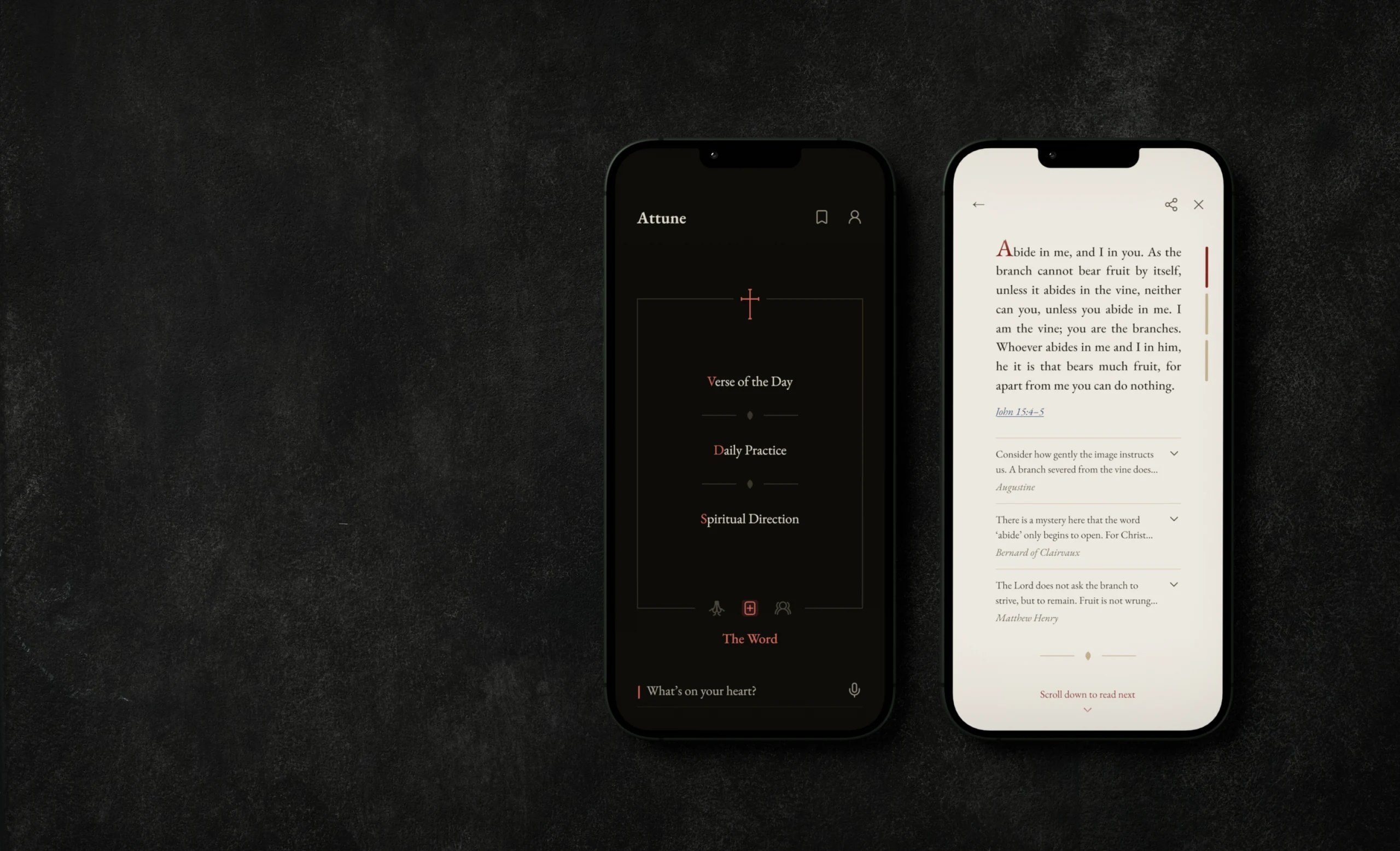
A reader writes what is on their heart, and Attune answers with a reading: a passage of Scripture, commentary on it from across the Church’s history, and a prayer. I designed the app end to end, and built a working prototype of 89 screens to test what frames couldn’t show.
The problem
AI answers usually arrive as chat, in bubbles that scroll out of sight. Scripture and prayer are read slowly, and a reader has to know whose words are on the screen: the Gospel’s, a fourth-century bishop’s or the app’s.
Three sources
The Word is Scripture. The Voices are the Church’s readers of it, from Augustine and Chrysostom to Luther, Calvin and Matthew Henry. The Prayers come from the Book of Common Prayer and older prayers of the Church.
A reader brings a worry, a decision or someone they pray for, in their own words, and gets a reading from all three. Each source also keeps three daily rituals, for days with nothing to ask.
The Word
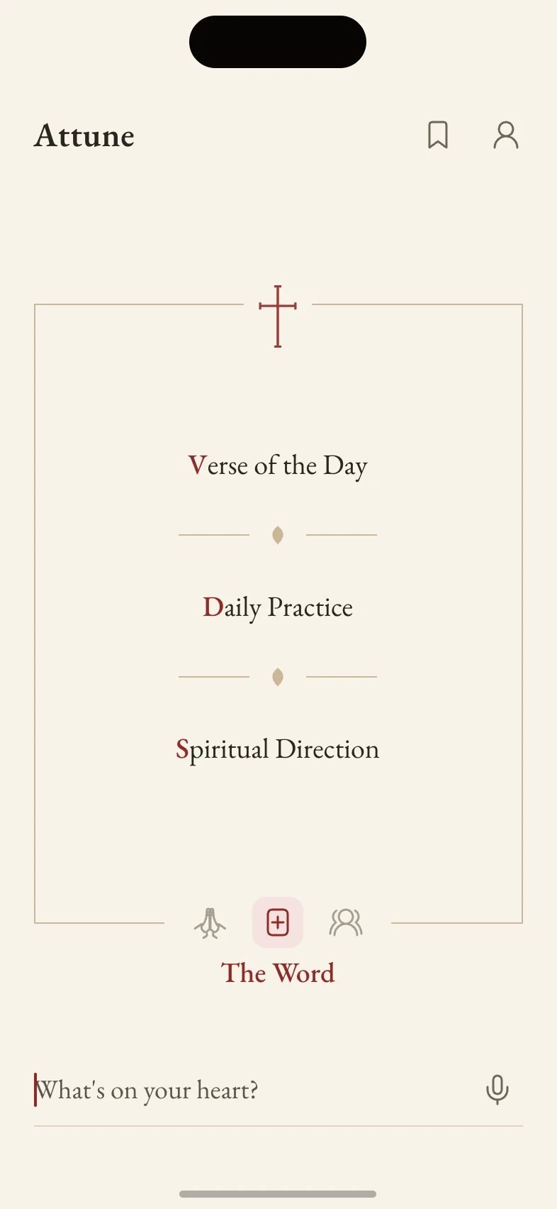
- Verse of the Day
- Daily Practice
- Spiritual Direction
Voices
- Thought of the Day
- Daily Reading
- Counsel
Prayers
- Prayer of a Day
- Prayer Rule
- Prayer Journey
An answer a reader can keep
An answer in Attune is a page. It shows one passage at a time with its source in view, and it stays on screen until the reader moves on.
I designed the whole app around that page: onboarding, the three sources, sharing, saved readings, subscriptions, errors, and a path to crisis resources when a message shows signs of danger.
What the design had to do
- Every answer reads like a page of a book.
- A reader always sees who is speaking.
- The daily rituals are one tap from home.
- Nothing breaks on a 4.7-inch phone.
Try it
Every screenshot on this page comes from this prototype. Pick where to start, or explore from home.
It fills the phone’s screen. Ask a question, then scroll on at the end of each passage.
The reading
Every flow in Attune ends on a reading.
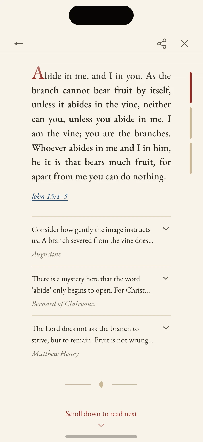
- 1The mastheadBack, share and close. When the passage scrolls past, its reference docks here in lapis. Tapping it returns to the passage.
- 2The rubricated initialOpens the passage.
- 3The measureJustified, on a measure narrower than the rest of the app. The words run under the masthead and the home indicator into paper veils, so no line is cut hard at an edge.
- 4The citationIn lapis, underlined. It opens the whole chapter, with the verses quoted on a tint.
- 5The voicesThe first two lines of each reader, then the name in italic. A row opens in place.
- 6The railOne segment per item, the current one in rubric. Tap a segment to go to its item.
- 7The end of the itemA leaf between two rules, then a prompt to read on.
How Bibles were set
Before drawing the reading I reviewed how Bibles and prayer books were set, from Greek papyri to today’s reader’s editions: the marks, the ornament and the colours, where each came from and what it was for.
Anatomy of an opening
A furnished page is a stack of layers, each added by a different hand. The text block is only the middle one.
Biblical script symbologyExpandCollapse
Division
What separates one unit from the next. The mark starts in the margin, moves into the line, and ends as blank space.
Paragraphos
Greek papyri from the 4th century BC. A plain stroke in the left margin, level with the line where the topic changes. The ancestor of every paragraph mark.
Coroniseditorial
Marked the end of a section or a whole work in ancient rolls. The oldest closing mark in the Western book.
Capitulum
The medieval C for capitulum, “little head”. It replaced an earlier K for caput.
Pilcrow
The capitulum after rubricators drew a bar through it and filled the bowl. It marks a new sense-unit, so in a Bible it often disagrees with the chapter numbers.
Section signsignum sectionis
A doubled S. Canon law first, then civil law, then any numbered subdivision.
Asterism
Three asterisks in a triangle. A soft break within a chapter, weaker than a section head.
Dinkus
Three spaced asterisks centred on a line of their own. Fleurons do the same job.
Dotted cross
Coptic. A divider that is also a cross.
Ornament
Ornament in these books always had a use: to fill a short line, mark a boundary, grade a hierarchy, or turn a page into something venerated.
Floral hearthedera, aldus leaf
The ivy leaf divided paragraphs in antiquity, and Aldus Manutius made it fashionable as a cast fleuron. A section break, a divider, or repeated into a rule.
Rotated floral heart
Points right. A run-in bullet, or the close of a line.
Reversed rotated floral heart
Points left. With U+2767 it brackets a centred line, a common gesture on a title page.
Flower punctuation
A lighter divider, closer to a dinkus than to a fleuron.
Palm branch
Martyrdom. Used sparingly.
Florettes
Geometric rosettes, for where a leaf would look too soft.
Christograms and crosses
The oldest layer. Abbreviations of the sacred names that stopped being abbreviations and became emblems.
Chi-Rholabarum
Chi over rho, the first two letters of Christos. Carried on Constantine’s standard from 312.
Alpha and Omega
First and last. It flanks the Chi-Rho and is almost never used alone.
IHS
The first three letters of ΙΗΣΟΥΣ, read in the Latin West as Iesus Hominum Salvator. The dominant Western christogram.
Ichthys
Greek for fish, read as an acrostic: Jesus Christ, God’s Son, Saviour. The sign of the catacombs.
Latin cross
The long lower arm. The Western default, and the plan of a Western church.
Greek cross
Equal arms. The Eastern default, and the plan of an Eastern church.
Maltese cross
Eight points, read as the eight Beatitudes. The printer’s cross for liturgical rubrics.
Cross of Jerusalem
A potent cross with a small cross in each quadrant: the five wounds, or the Gospel reaching four corners.
Orthodox cross
Three bars. The lowest is slanted for the two thieves, up toward the one who repented.
Apparatus and liturgy
Marks that point away from the text, to a variant or a note, and marks that tell someone in a service what to do.
Asteriskasteriskos, “little star”
In Origen’s Hexapla, text in the Hebrew but missing from the Septuagint. In a breviary, the pause in a chanted psalm verse.
Obelusdagger
Aristarchus marked suspect lines of Homer with it. Origen borrowed it for Septuagint text with no Hebrew counterpart.
Manicule“little hand”
The reader’s own mark, first attested in Domesday Book, 1086. The medieval highlighter.
Versicle
A V struck through: the officiant’s half of an alternating verse.
Response
An R struck through: the congregation’s answer. With the versicle, the oldest way print marks who speaks.
What Attune took from them
Rubric
Rubrica is red ochre, the rubricator’s ink. Titles, chapter numbers, instructions, paragraph marks and initials were red.
In Attune
Red marks what a reader can act on: the initial of a door, the current segment of the rail, the hint to read on, a filled button.
Lapis
Ultramarine, the illuminator’s blue. Paris Bibles alternate it with red in their initials and paragraph marks.
In Attune
Blue marks who is speaking: citations and the names of the voices.
Versal
The enlarged first letter, graded in size from the opening of a Gospel down to a paragraph.
In Attune
A red initial opens every passage and every door on home.
Fleuron
The floral heart, from the ornament above.
In Attune
Closes every item, in sand.
Florette
A rosette, from the ornament above.
In Attune
Marks the break during the pull.
Latin cross
From the crosses above.
In Attune
The finial on the top edge of home’s plate.
Reader’s edition
Bibles since 2005 that drop verse numbers and cross-references and set one wide column.
In Attune
A reading is one justified column, with no verse numbers.
Reviewed and left out
Red letters
Since 1899 red-letter Bibles print the words of Jesus in red. In Attune red already has a job.
Gold
The third pigment. Ornament is set in sand, quieter than either ink.
Blackletter
The initial is set in the reading’s own Garamond.
Morning and Evening
Evening reverses the lightness and keeps the hues, so Morning and Evening stay one design. It follows the phone’s theme, and Display Settings can pin either.
Moving between passages
A reading usually has three items: three passages with their voices, three voices on one theme, or the prayers of an hour. Moving between them took four versions.
The first design laid the items side by side as cards, with dots and arrows. It split a reader’s attention between two directions, down to read a card and sideways to change it, and it hid how long a card was.
I built the two strongest alternatives, a swipe deck and a sticky scroll, as one-page trials in code, because the difference only shows on a phone. Sticky scroll won. It keeps one direction for everything, never skips an item by accident, and the rail always shows where the reader is.
The pull
Scrolling stops at the end of an item, and a fling never runs into the next. To go on, a reader pulls past the end: the page stretches like a rubber band, and the hint counts down in words (“Keep scrolling”, “Almost there”) until the next passage arrives. Let go early and it springs back.
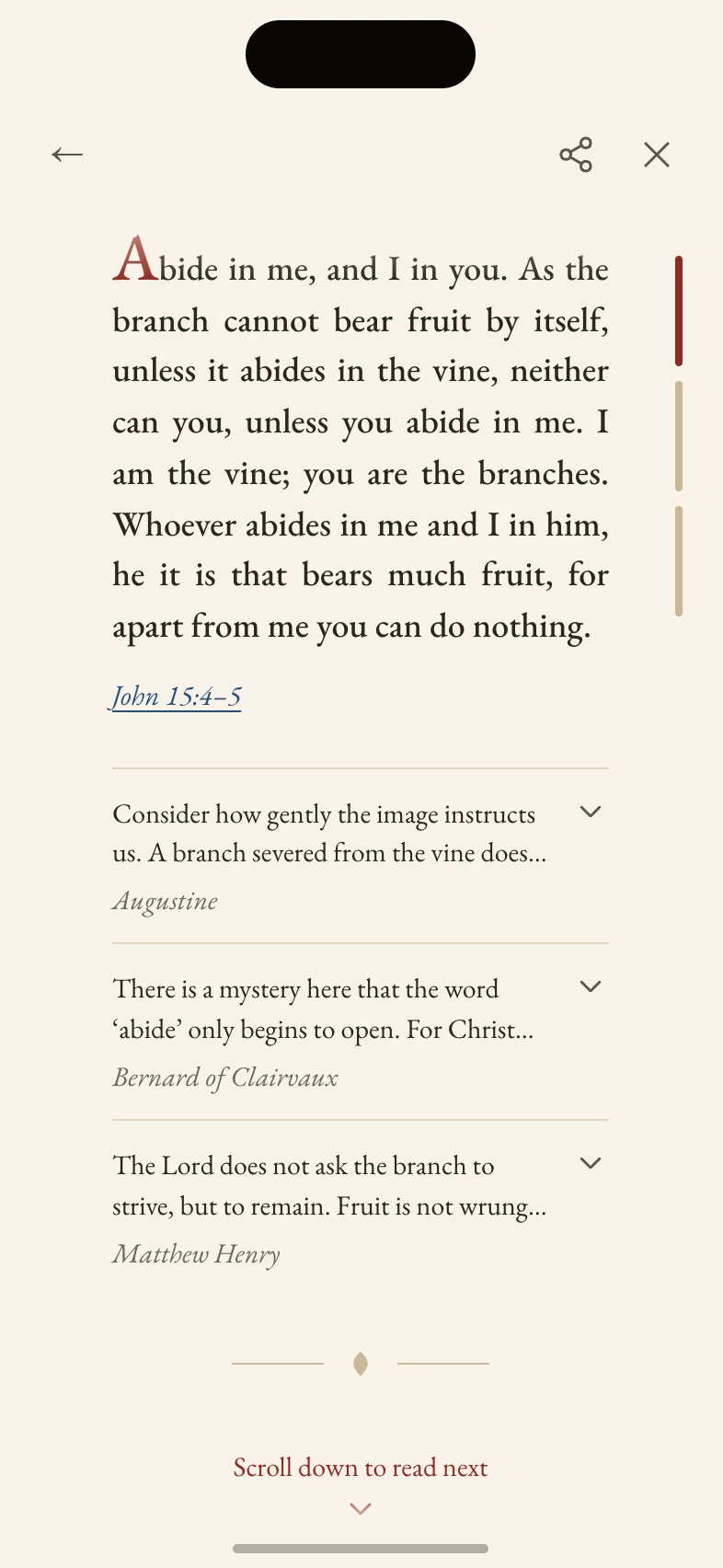
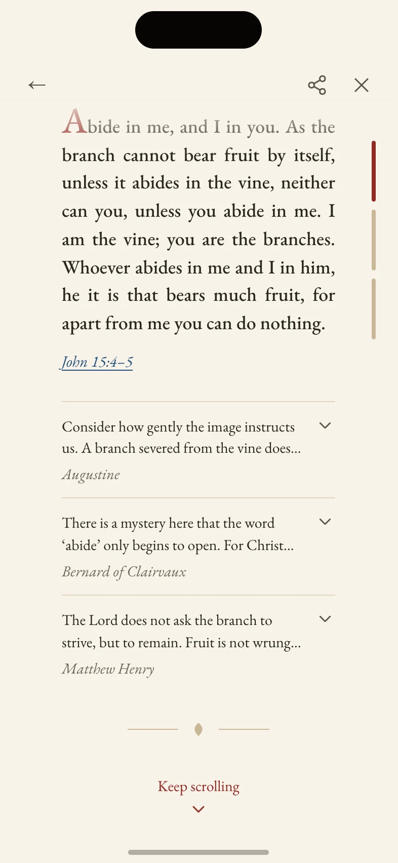
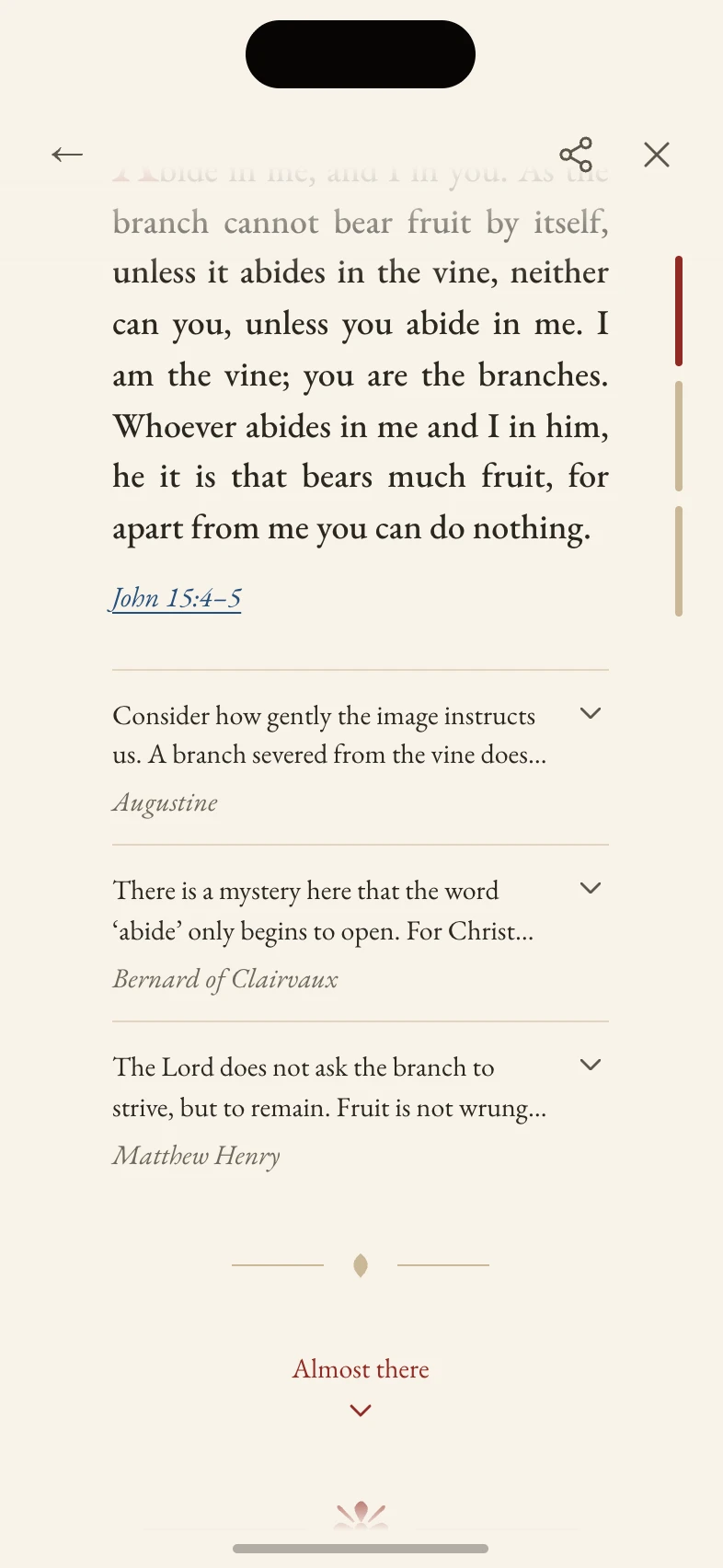
An item first appears with the reading’s reveal and scrolls in after that. Each item keeps its scroll position and open voices while another is read.
Long voices, cut to fit
A voice can run to 2,000 characters, and a reader who can’t see the end can’t tell there is more. So each voice is cut at whole paragraphs to fit the screen, with Expand under the cut. A shorter phone shows less.
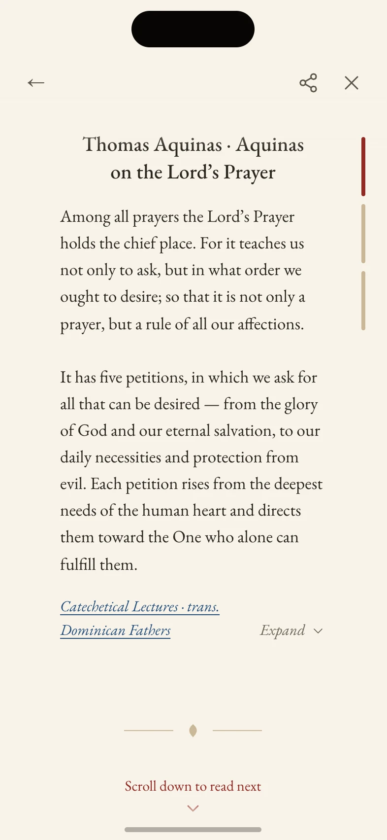
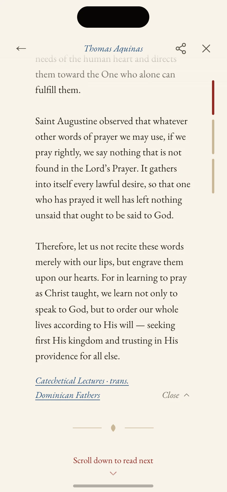
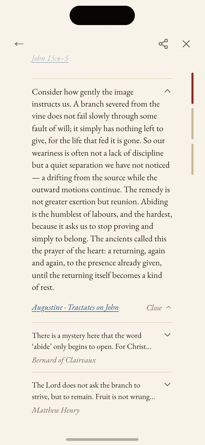
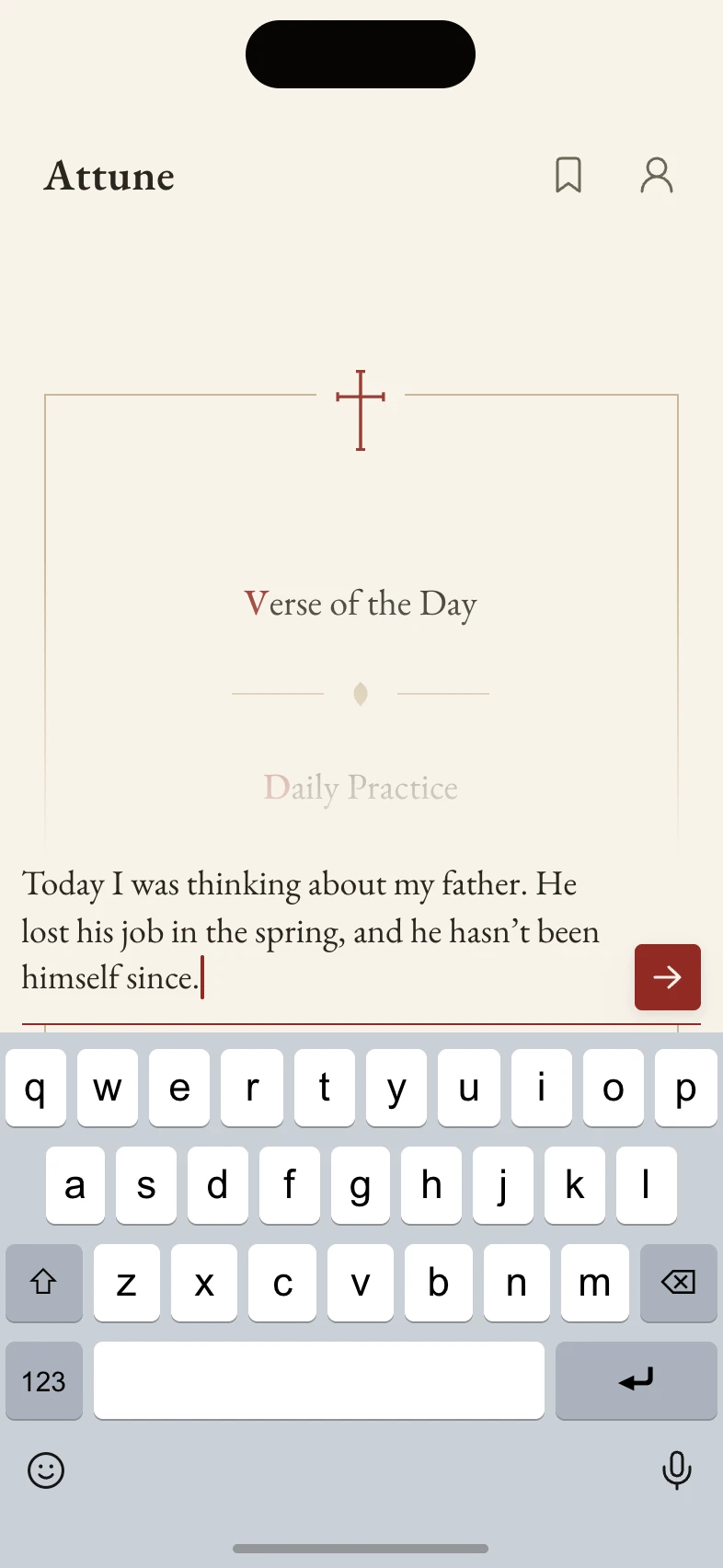
Typing over the page
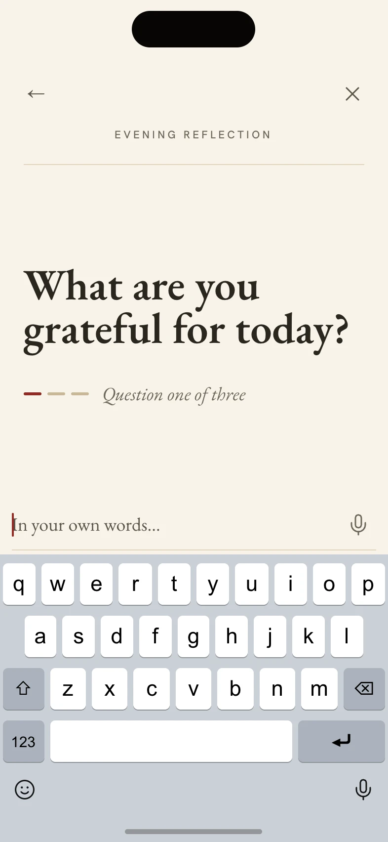
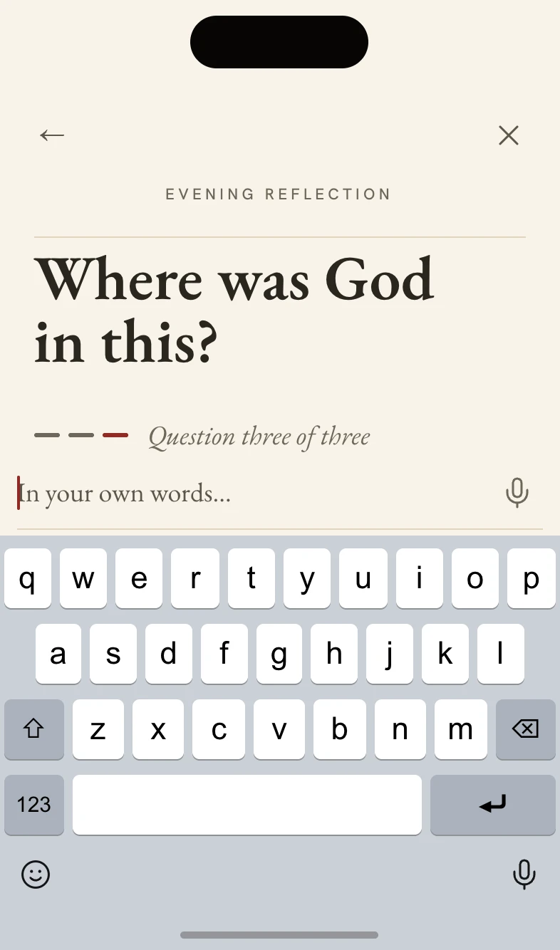
The question field grows over the page under a paper veil, and home stays in place. On the ask screens the question is set as large as the space allows. A question that fails to send keeps its words exactly as typed.