Grip · Brand identity · 2022
Grip rebranding
Grip’s mission is to represent every product in the world with state-of-the-art visual content, made automatically from photorealistic 3D. Its brand didn’t say what the company stood for, and there was no shared visual inventory: departments invented brand elements as they needed them, and the brand washed out. As senior creative, I rebuilt it (positioning, logotype, colour, type and imagery) in one set of guidelines.
- Client
- Grip
- Role
- Senior creative: brand and graphic design
- Deliverable
- Brand guidelines
- Year
- 2022
- Outcome
- Rolled out in 2022; later replaced by a newer brand
Goals
- 01Brand guidelines covering positioning and design.
- 02Documentation and a visual inventory for marketing and external partners.
Visual principles
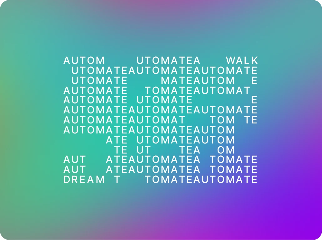
Repetition
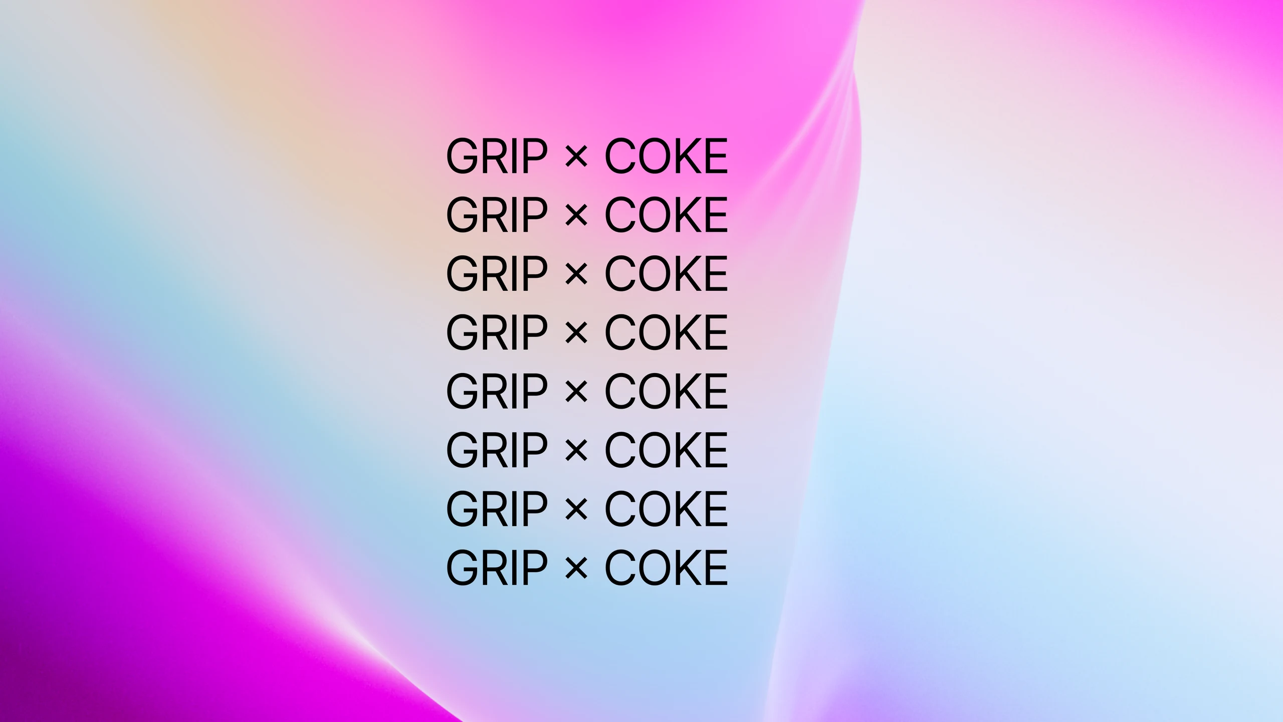
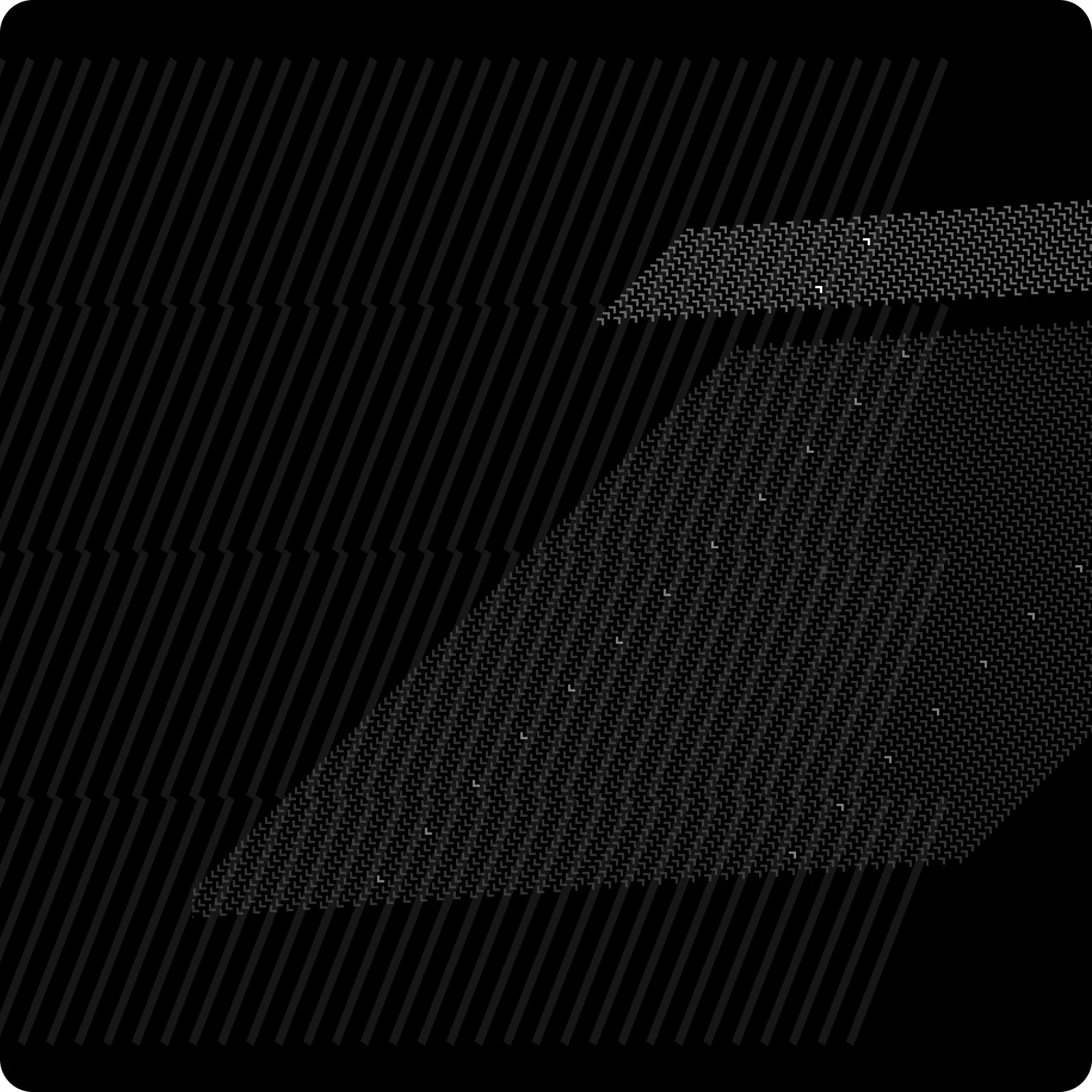
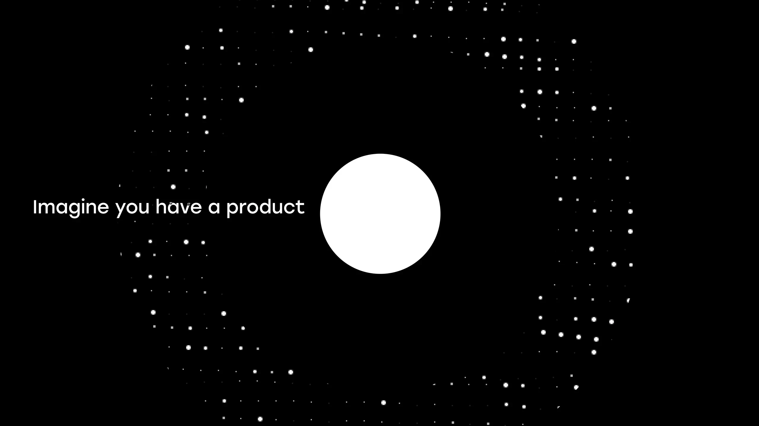
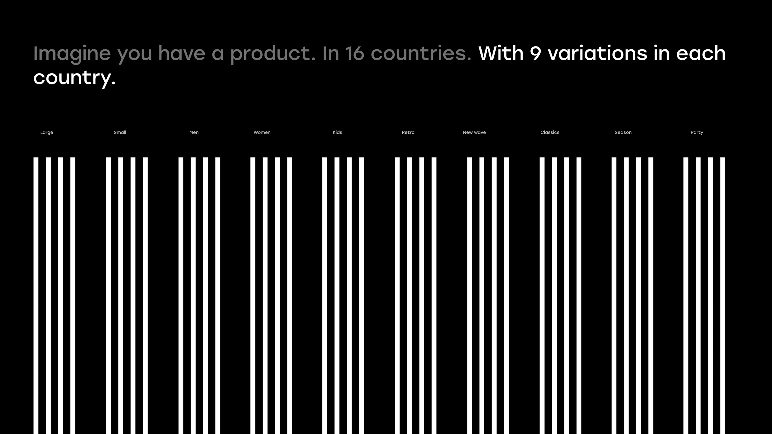
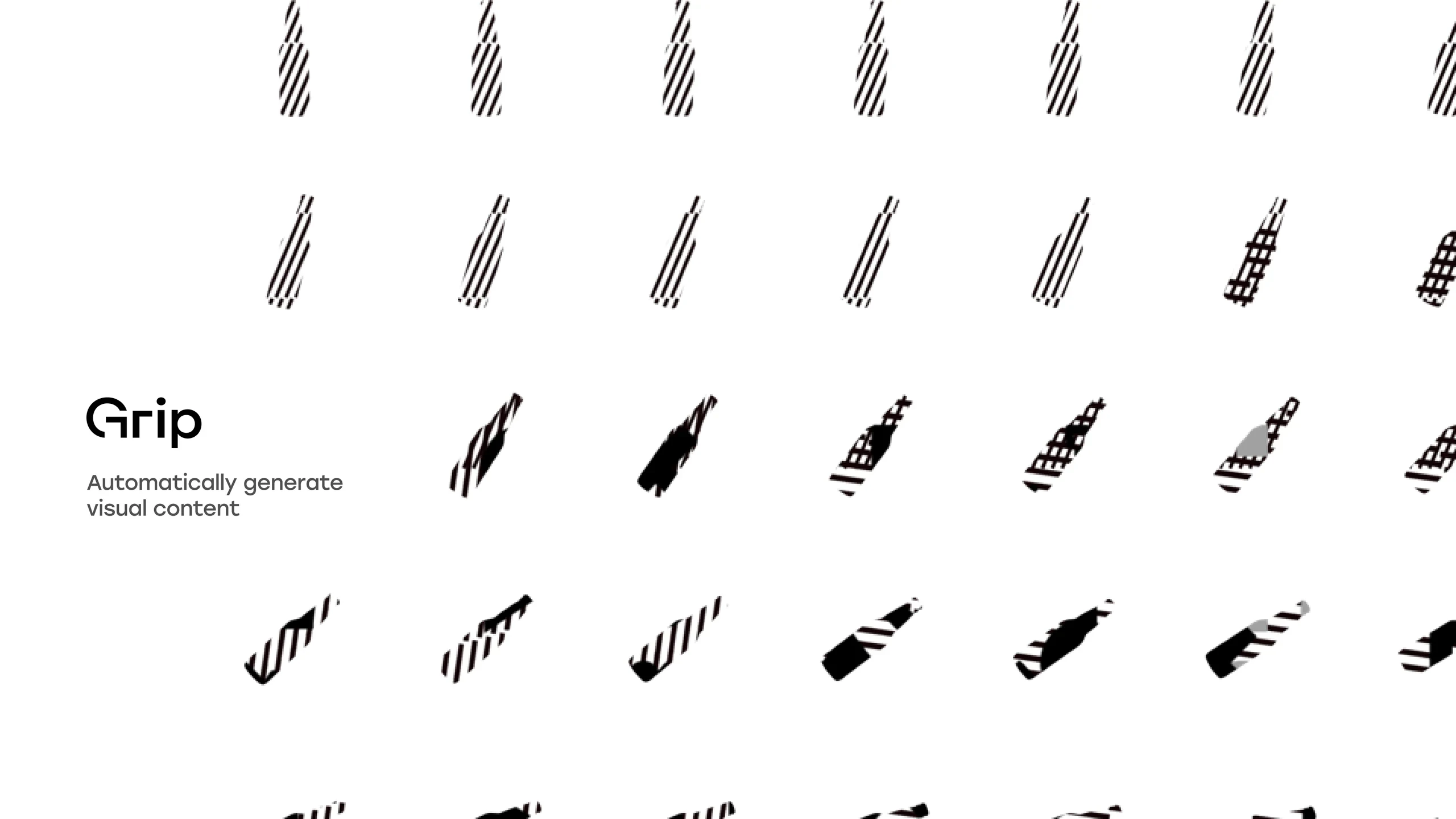
Speaks to the scalability of Grip in the automation of content production, conveyed primarily through typographic behaviour.
Transition
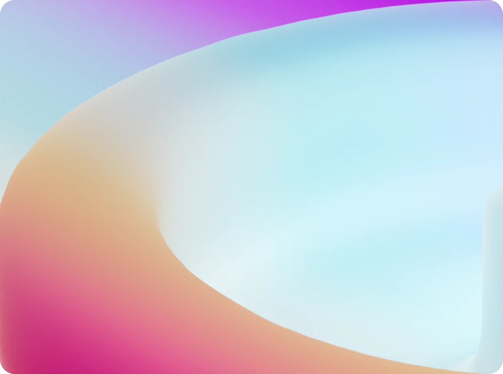
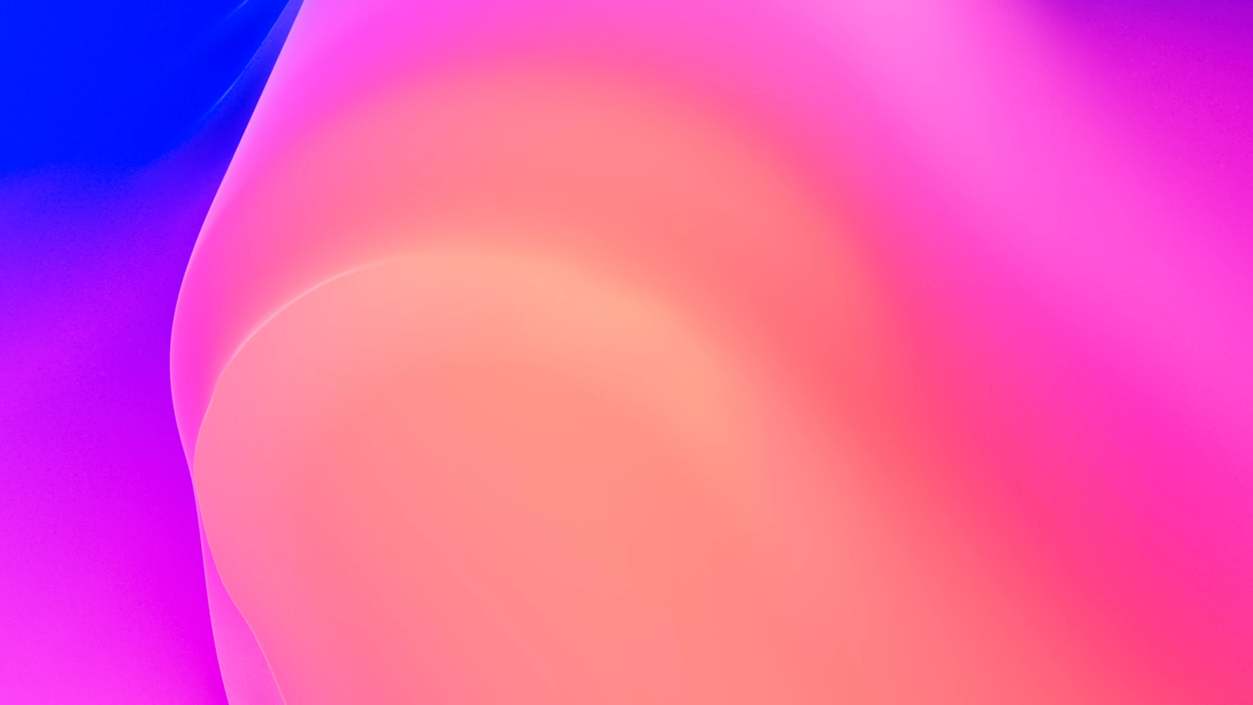
The continuous transition between the physical, digital and virtual world. The gradients represent real physical and virtual objects: focus on three-dimensionality.
Beauty
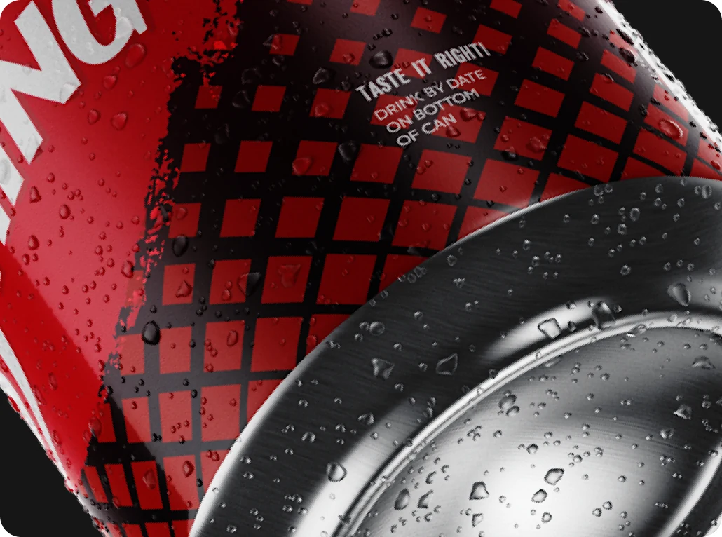
Every product holds a certain beauty and deserves to be represented with state-of-the-art visual content.
Colours
Colour underlines the transformative power of Grip. The process every product goes through is expressed with strong, vibrant colours that put the long, complex tail behind each photo or video on the spot. It is important for our statement: beauty codified.
Strong
Vibrant
Transforming
Primary colours
Mixed colours
Derived from mixing the primaries in a certain proportion. They are not fixed, and are shown purely as examples.
Gradients
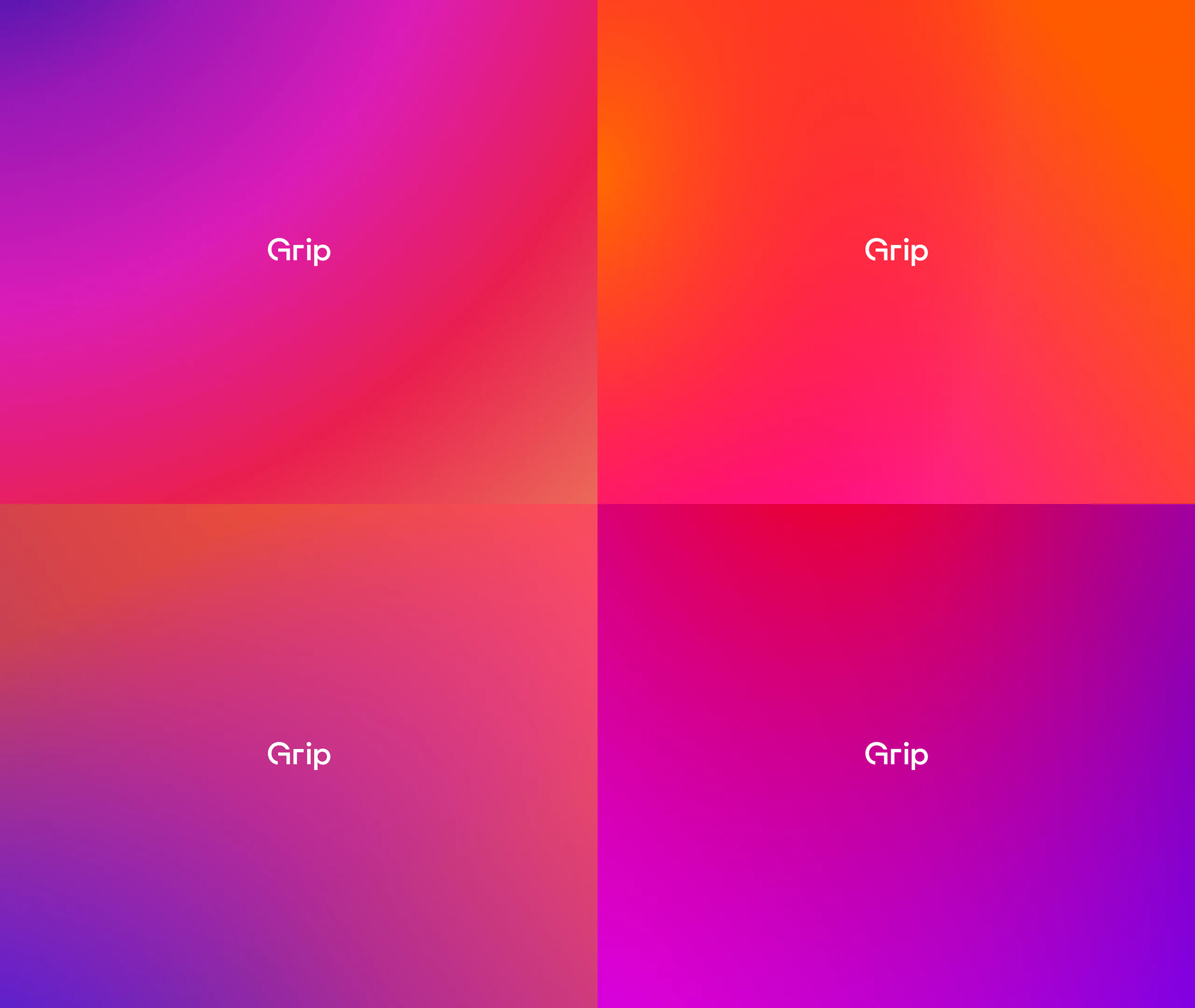
Warm + cold
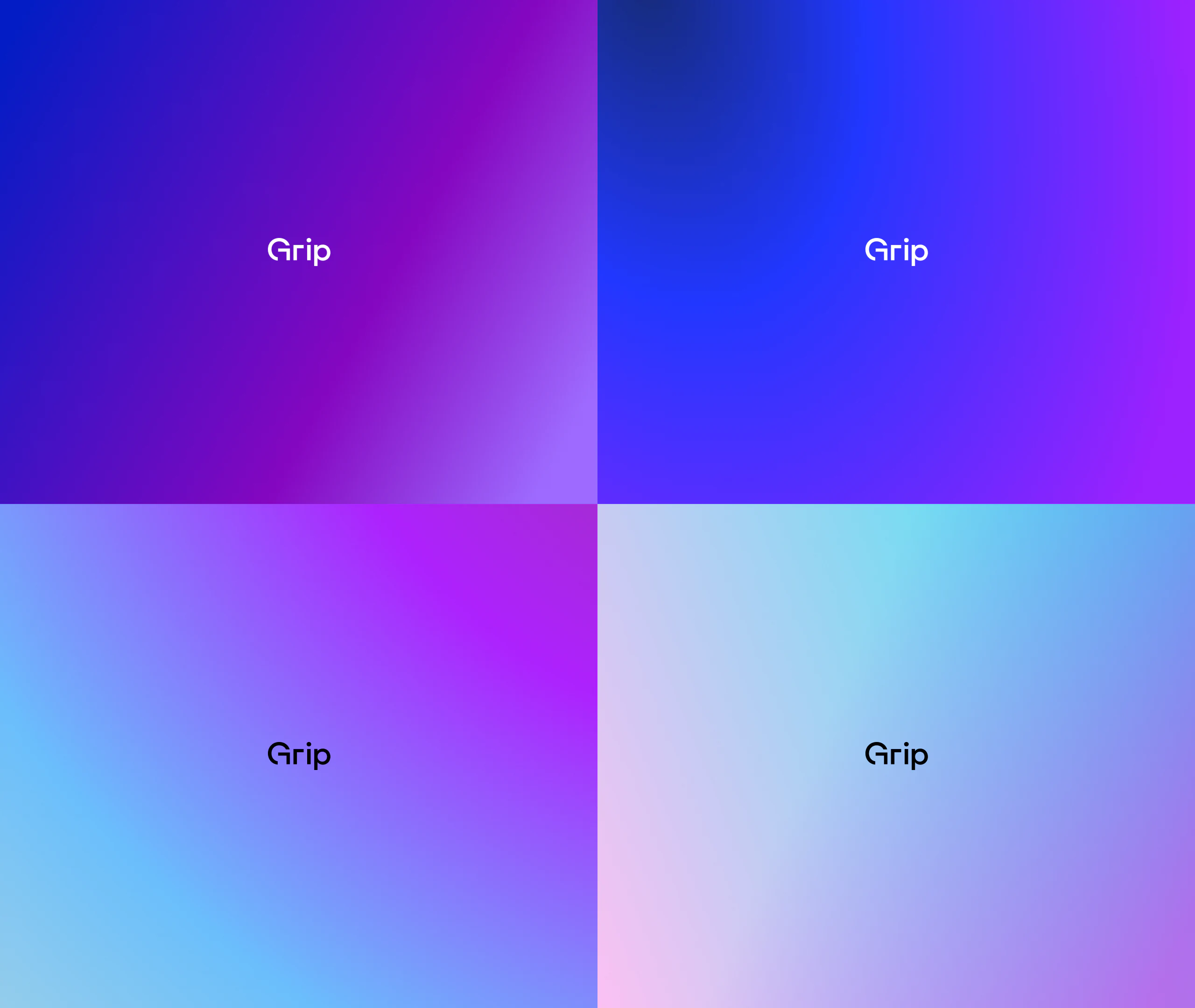
Gradient use is looser and open to exploration, mainly for background imagery. Gradients are never used in UI elements or in top-layer text.
Vibrant + calm
Primary shades
Secondary cool
Secondary purple
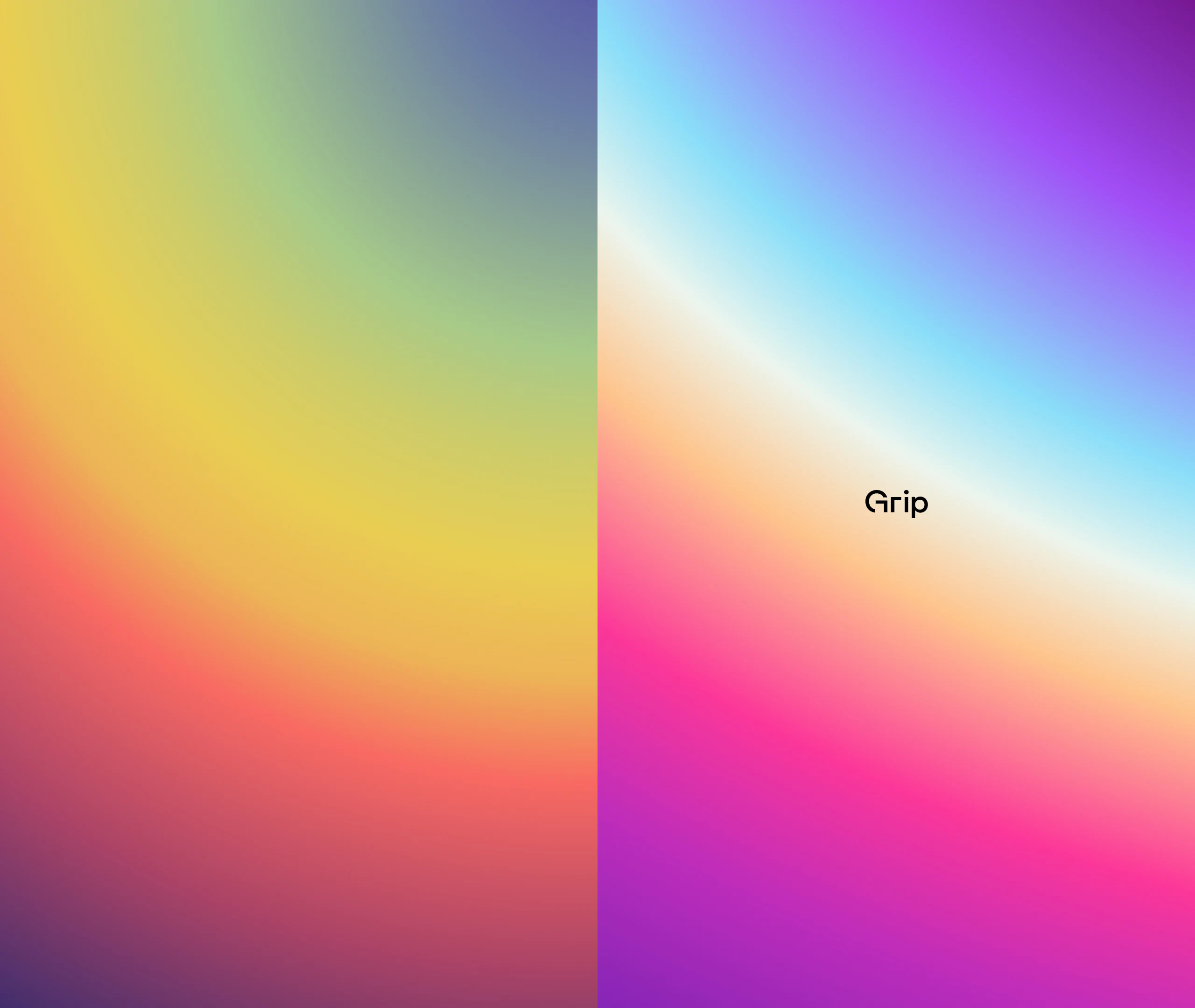
Couplets and triplets
Colours are never mixed outside of gradients or imagery. Typefaces, icons and text stay out of these colour variations.
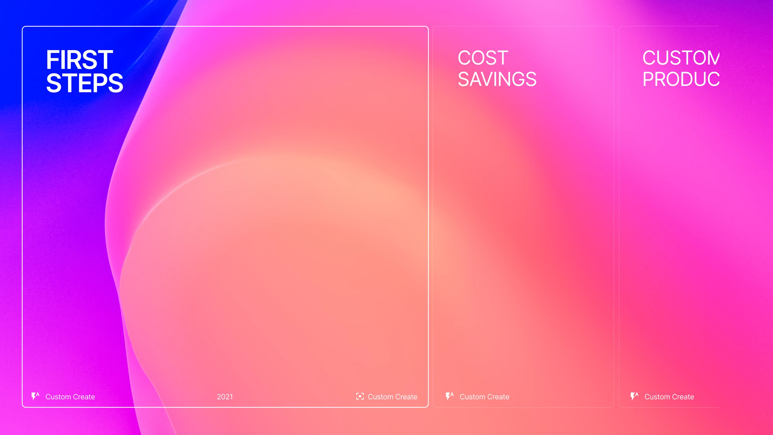
Shapes and colours
Renders and imagery
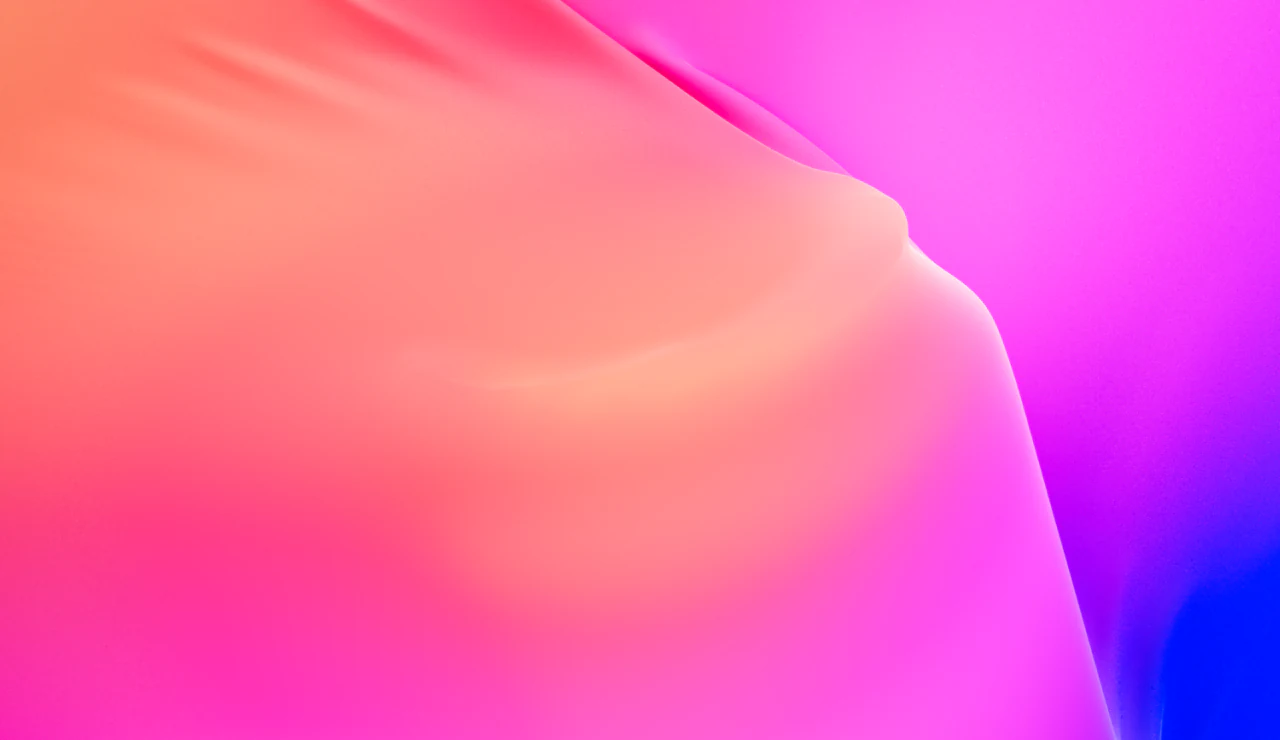
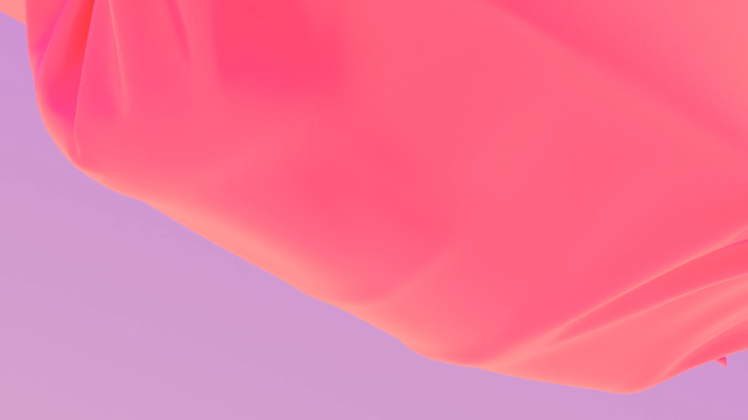
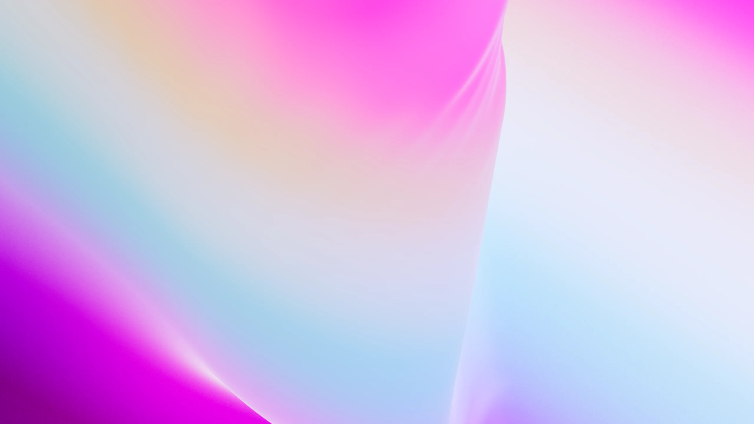
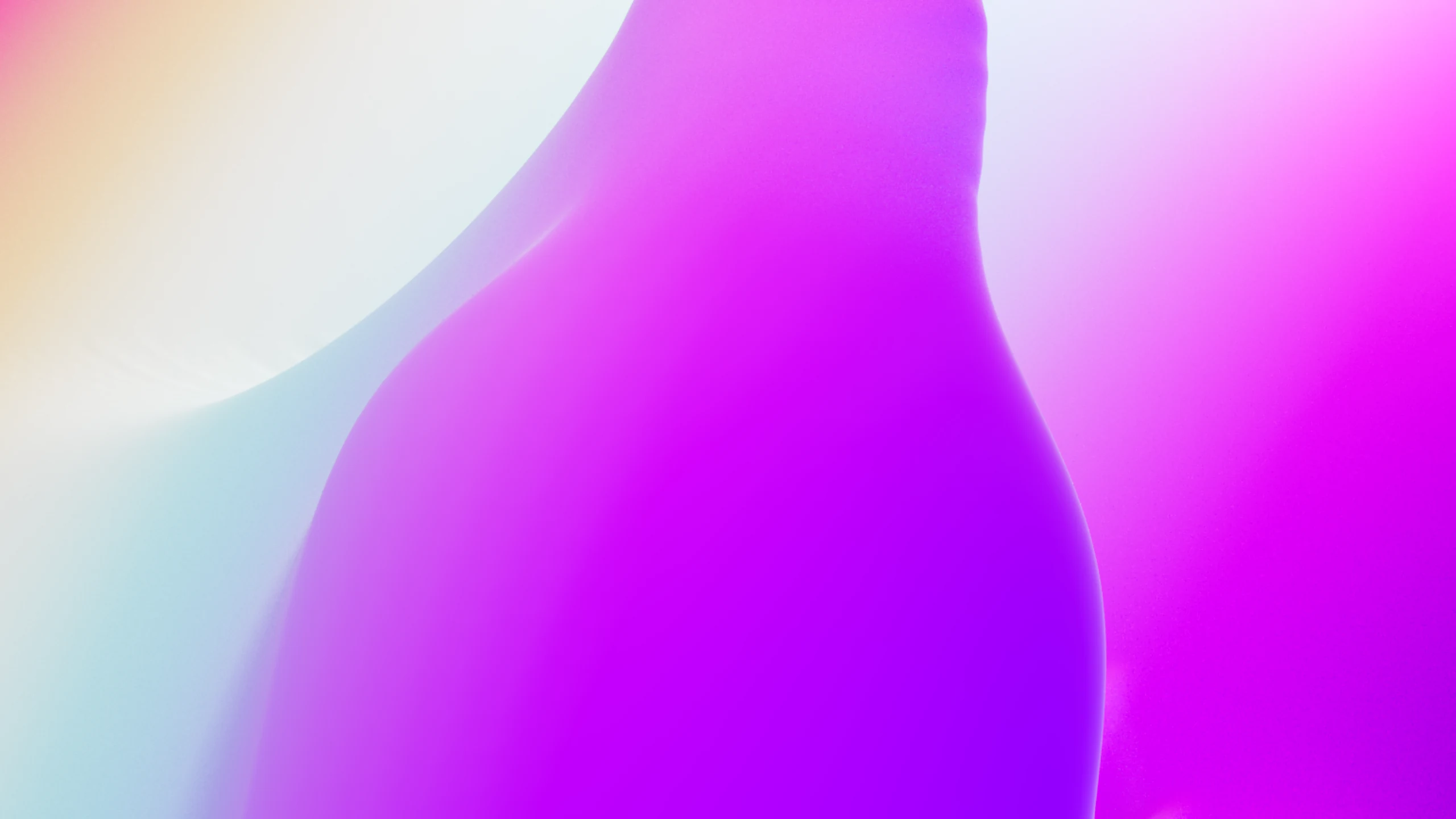
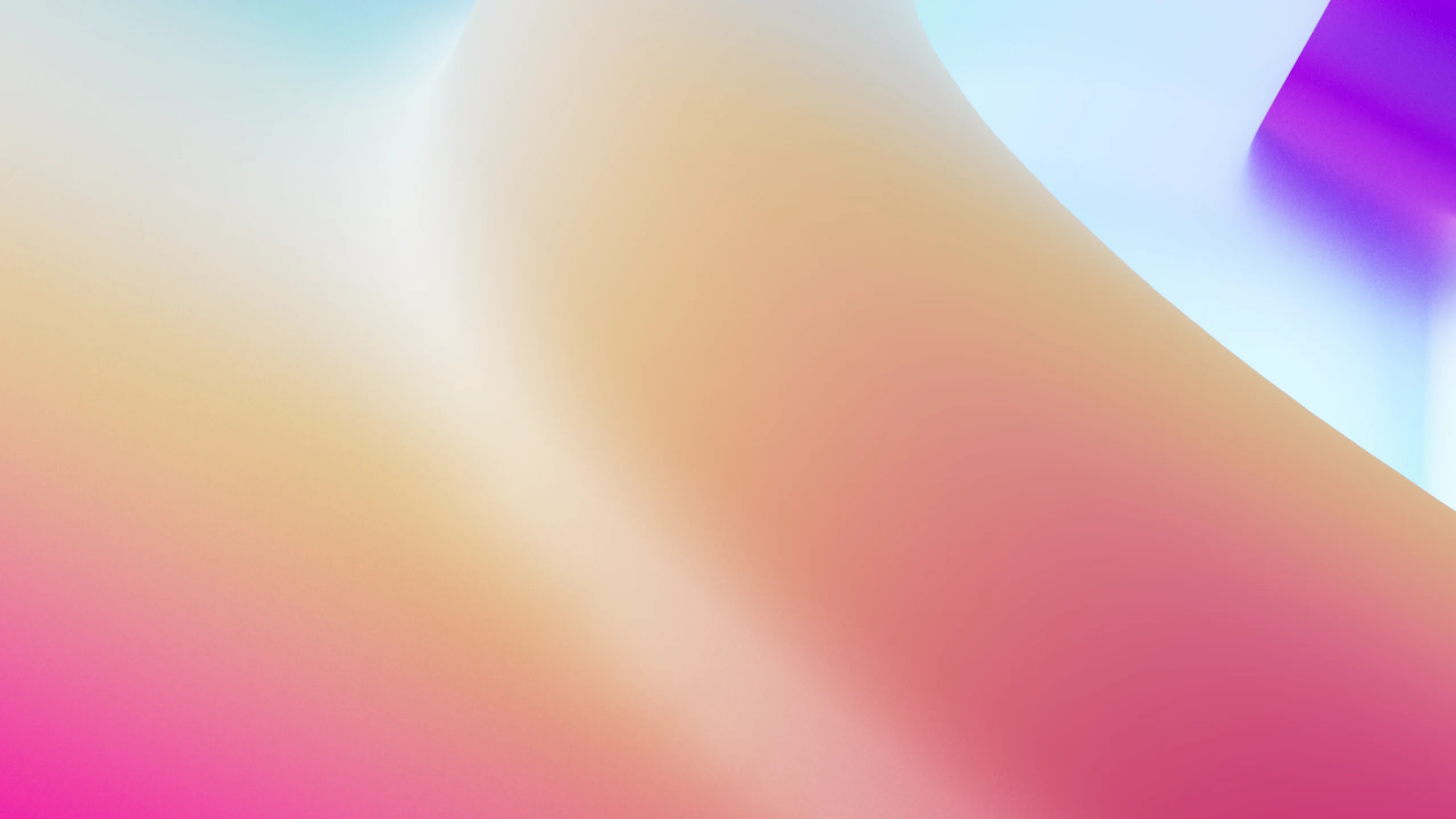
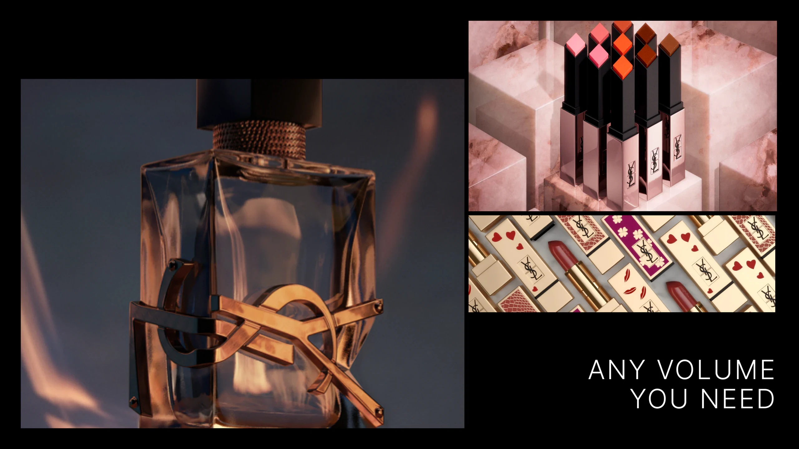
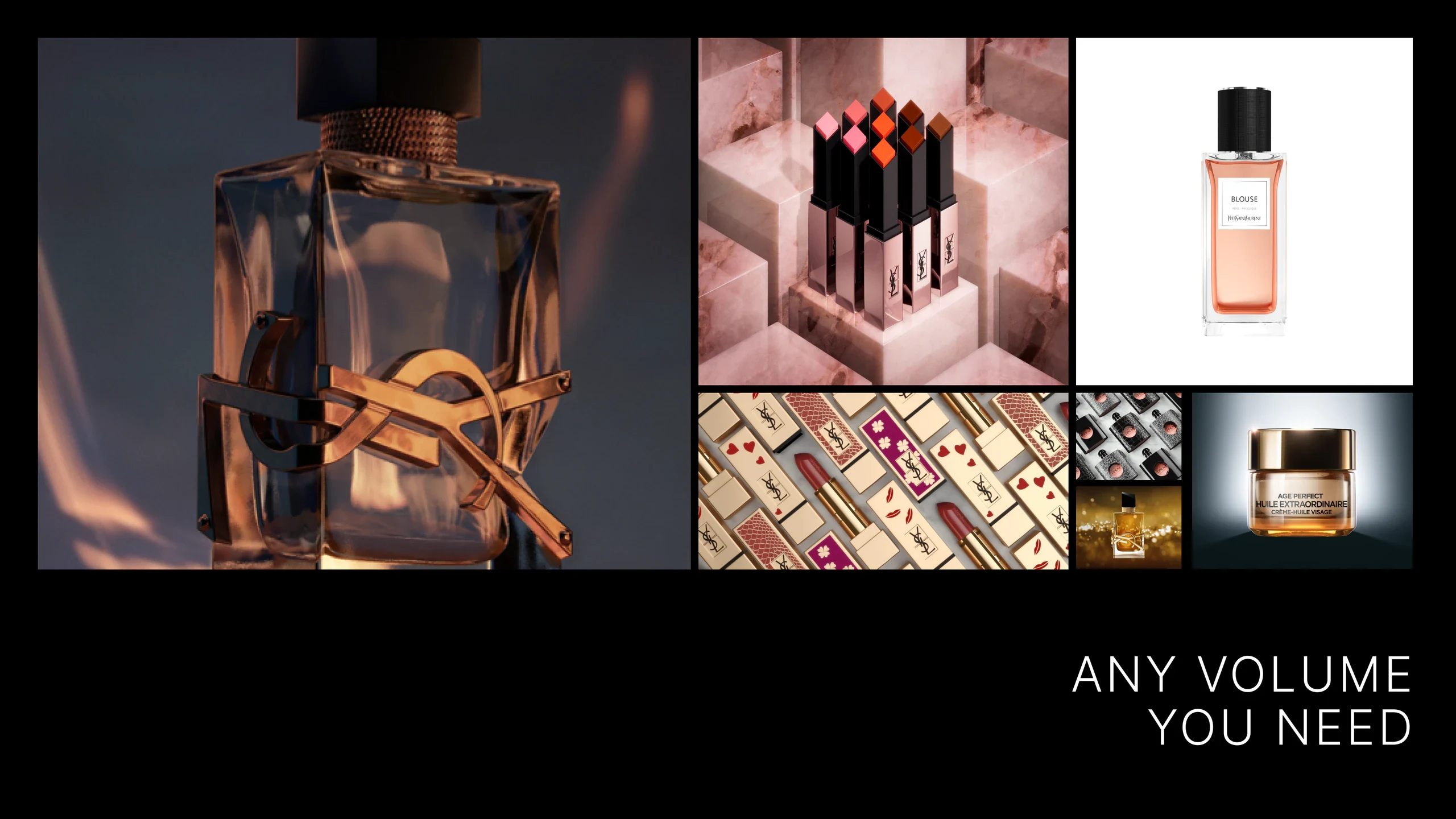
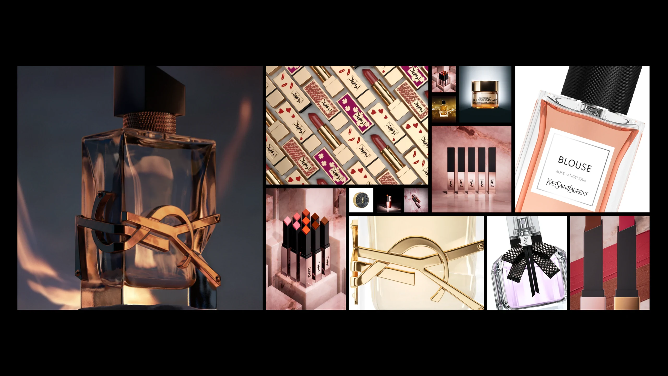
The evergreen 3D imagery abstractly represents the stages of product digitisation, from raw essence to fully realised photo-real imagery. Each stage serves different uses, from textural to explanatory.

01. Essence
Abstractly visualising the raw material of Grip.
02. Forming
From the raw material, a form begins to take shape.
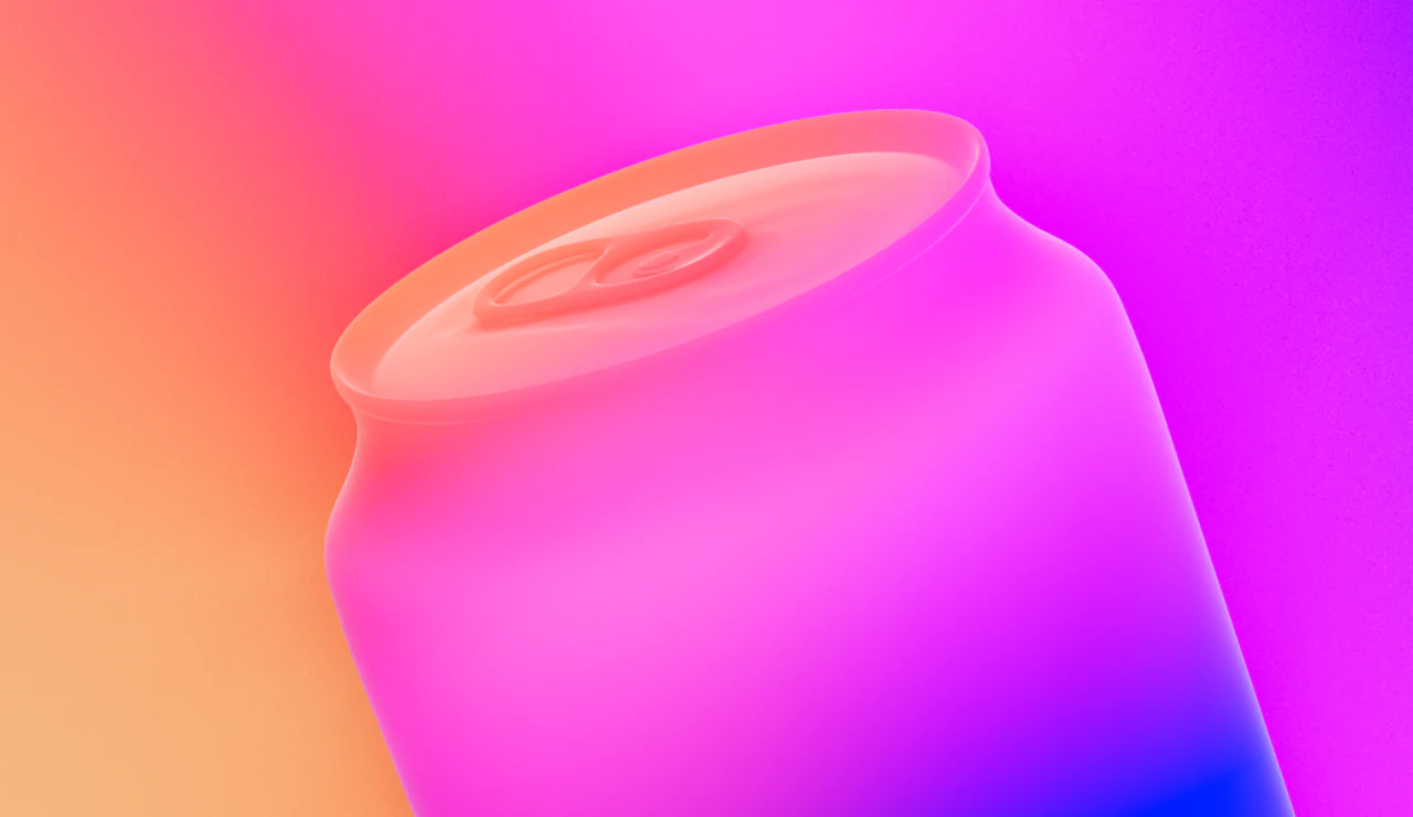
03. Materializing
The form becomes recognisable, still overlaid with the Grip palette.
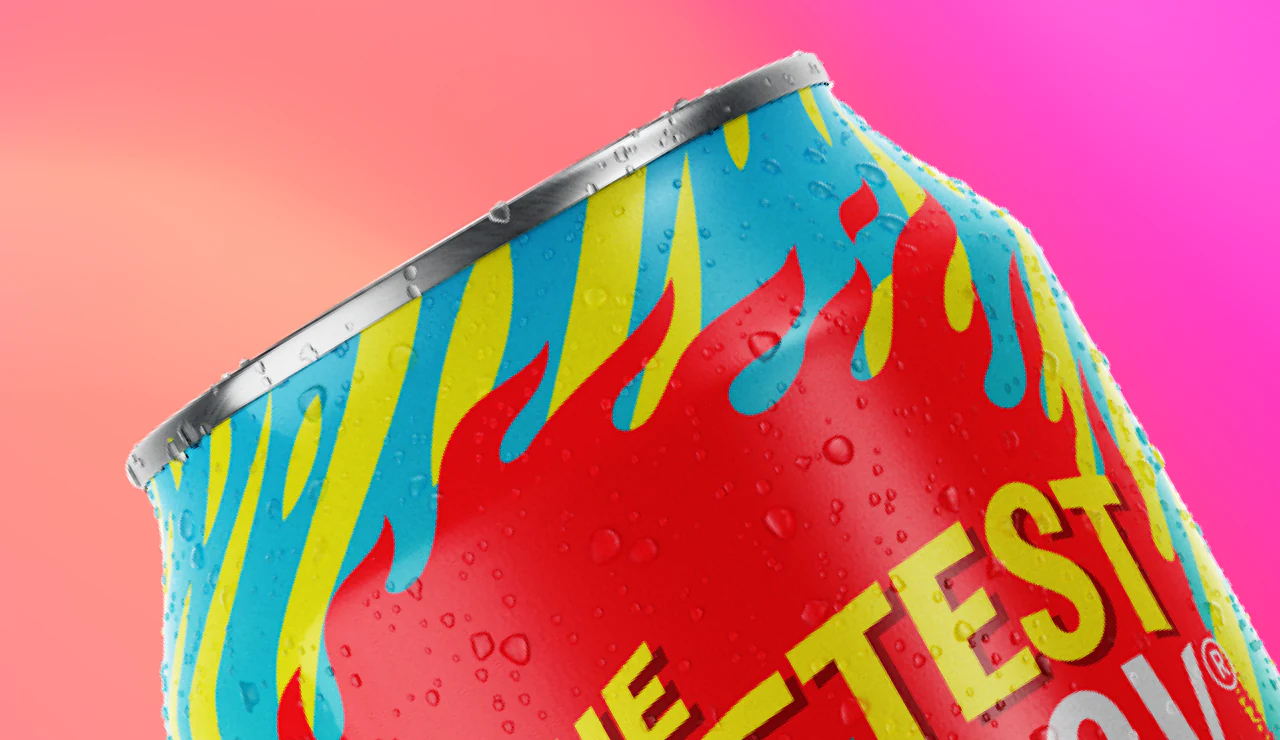
04. Realizing
Textured and wrapped, the product reaches final photo-real quality.
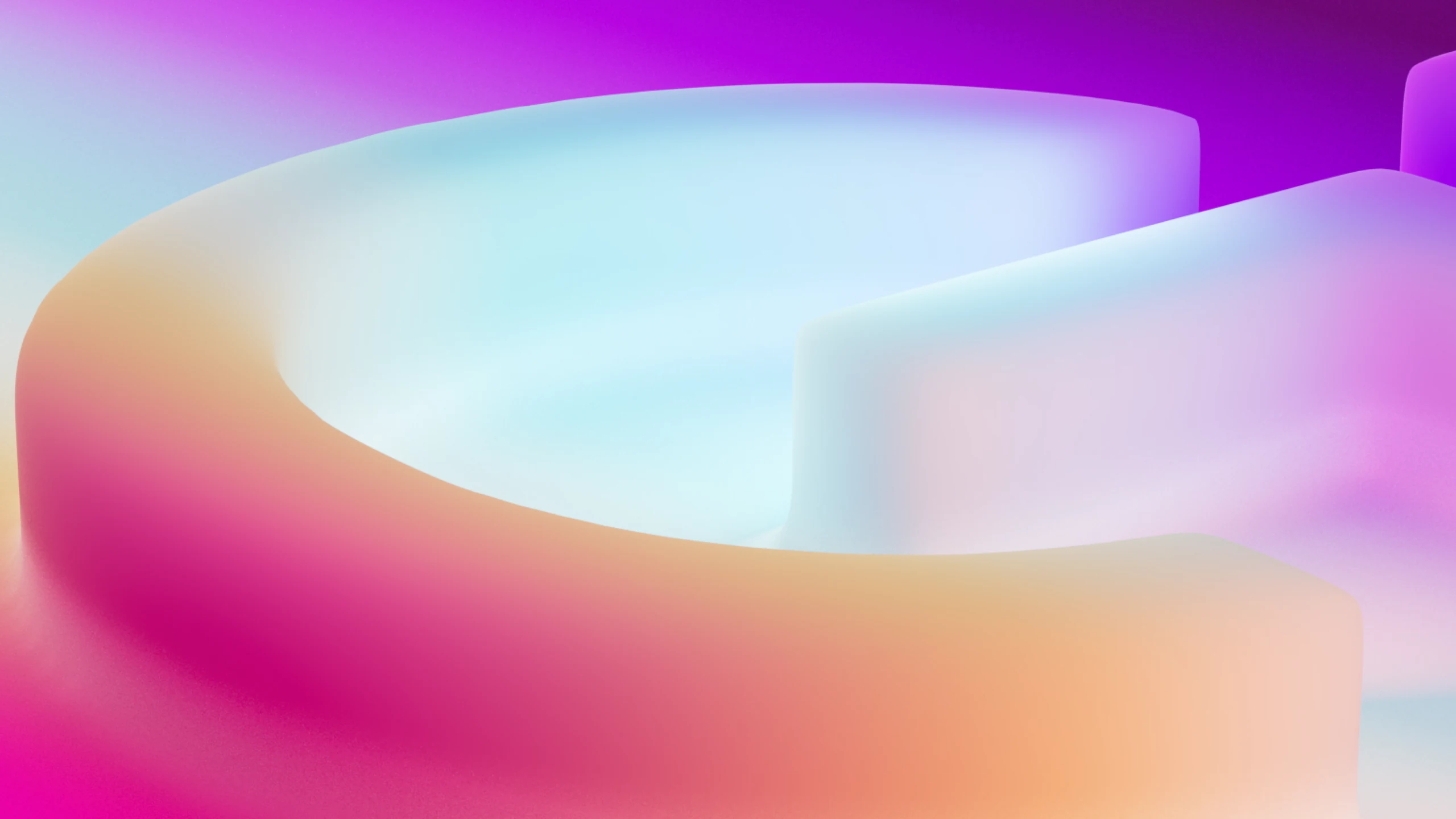

Black & White examples
Logotype
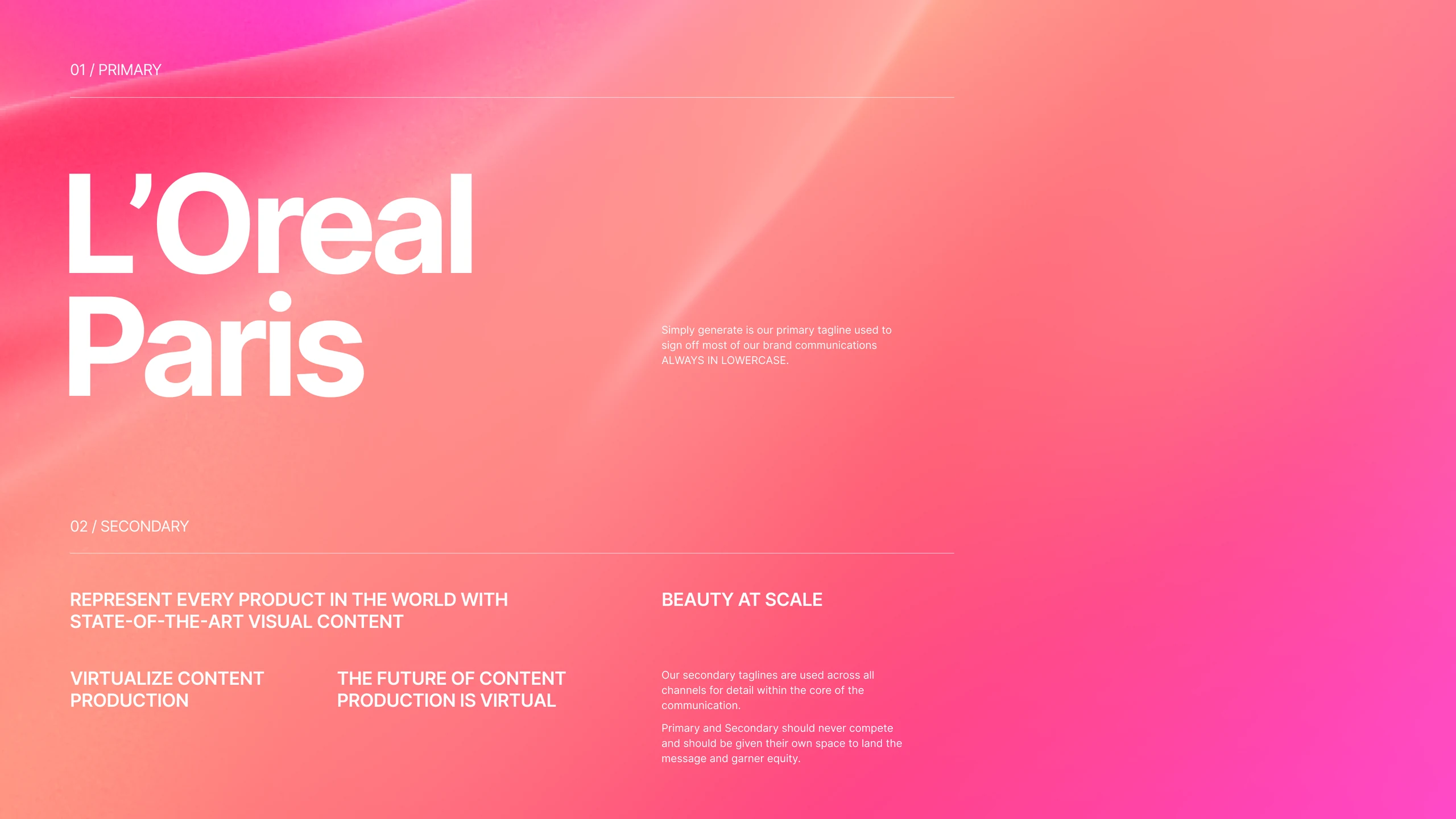
The logo is artwork: created, designed and set to have maximum optical legibility at every size. It is never altered, and only ever used in the colours shown here.
Clear space
Clear space gives the logo room to breathe and preserves its legibility. It is measured in units taken from the wordmark itself.
— Spacing unit
Minimum size
For legibility, the primary logo is never scaled below 10 mm across.
Typography
Primary
Typography is an essential component of the visual identity. It puts heavy emphasis on contemporary typographic expression, but also ensures clarity of communication.
The typeface reflects Grip’s innovation and design-function roots, and is the core of the brand’s sophisticated expression.
Inter font family
Weights
Regular24 pt1.5 line0% tracking
Regular text. With every product we speak of, we should show just how much is happening behind the scenes. The language of liquid shapes and splicing of layers of a 3D shape will help us in that.
Medium / Regular32 pt1.5 line
Key statement. As key grip assists in all things for a cinematography fieldwork, same way our brand is key.
Regular14 pt1.1 line0% tracking
Typography is an essential component of the visual identity.
Our identity puts a heavy emphasis on contemporary typographic expression, but should also ensure clarity of communication.
We have chosen a font that reflects our innovation and design function roots. It’s derived from our technological innovation foundation and is the core of the sophisticated expression of the brand.
Regular16 pt1.1 line0% tracking
Typography is an essential component of the visual identity.
Our identity puts a heavy emphasis on contemporary typographic expression, but should also ensure clarity of communication.
We have chosen a font that reflects our innovation and design function roots. It’s derived from our technological innovation foundation and is the core of the sophisticated expression of the brand.
Size and formats
Regular / Semibold72 pt — up to maximum fitting on a page
Grip works
In every predictable
Way to work
Regular48 pt — up to maximum
Agenda
Agenda
Agenda
Semibold36 pt1.1 line
Medium / Regular36 pt1.1 line
Semibold subheader
Medium subheader
Regular subheader
Semibold32 pt1.1 line
Medium / Regular32 pt1.1 line
Semibold subheader
Medium subheader
Regular subheader
Semibold24 pt1.1 line
Medium / Regular24 pt1.1 line
Semibold subheader
Medium subheader
Regular subheader