AAIC · Product design & UI engineering · 2026
An AI builds the lab. I designed how students work in it.
Galileo turns school science investigations into interactive 3D labs. An AI assistant writes each lesson from the curriculum, and the system builds the bench, the equipment and the physics. I owned everything students see and touch, as its product designer and its front-end engineer, and most of it ships in the customer release.
Connect1 / 4A cable is clipped from the battery holder to the coil, one end at a time. A ring marks where each end goes. Then the run starts.
Run and read2 / 4A run plays back. The cart hits the barrier and rolls back, and the scrubber follows it. Then Continue appears on the step card and a chart of bumper force and velocity opens.
Wait and continue3 / 4The time bar counts through ‘Wait for 5 minutes’ while the peat smolders under the glass cover. Continue appears when the wait is over. The next step has one instruction, with Continue on the step card.
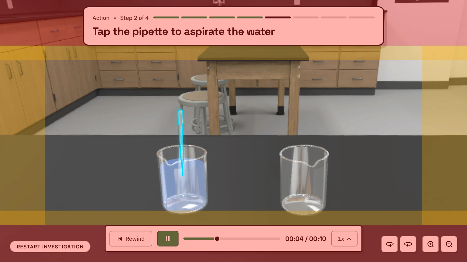
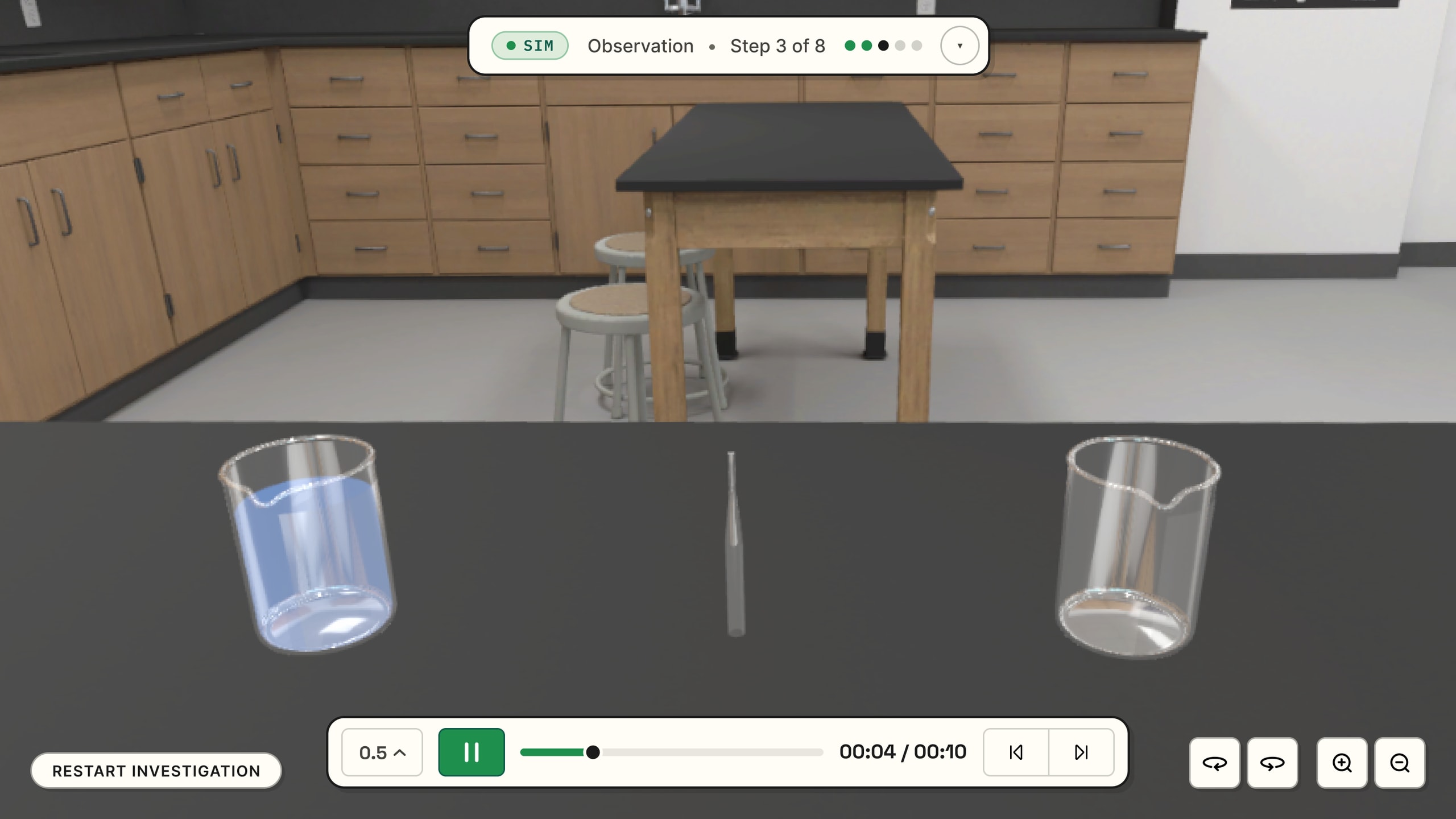
Pick up and place4 / 4The first click picks up a golf ball, and an arc shows where it will go. The second click places it above the bowl. The time bar reads ‘Calculating’ as the ball lands.
- Role
- Product designer and UI engineer
- Timeline
- April to August 2026
- Company
- AAIC
- Client
- Activate Learning
- Users
- Students aged 6 to 18
- Platform
- School Chromebooks and tablets
At a glance
Every lab is generated, so I designed the rules
- The problem
- Galileo generates each lab from a lesson script, often written by a model. Nobody designs a lab’s screens, and every lab has to work for students aged 6 to 18 on a budget laptop or a tablet.
- The approach
- Rules in place of screens: each part of the interface knows when to appear, what to say and where to go, without anyone configuring it.
- My part
- I designed how students work in the labs: picking things up, setting a force, reading the bench, moving through the steps and waiting for the physics. I built that layer in code too. The dev team wired the controls into the step engine, built the carry and the table strafe, and owns the pipeline, the viewer and the physics.
- The result
- The gesture control, object labels, the step card, the time control, camera framing, about forty device controls and the labs’ visual system ship in the customer release.
The problem
Designing for an author who isn’t a designer
Galileo is a text-to-3D system for science classrooms, built by AAIC for Activate Learning. A curriculum specialist picks an investigation, and an AI assistant turns it into a lesson script: which objects are on the bench, what each step asks the student to do, and what should happen. The system works out the rest. Watch the three-minute product video.
- CurriculumAn investigation from a science curriculum such as OpenSciEd
- Lesson scriptWritten by an AI assistant, adjusted by a specialist. Intent only.
- PipelineResolves positions, trajectories and camera poses
- My workViewerUnity renders the bench. The kit draws everything the student reads and touches.
- Physics serverComputes each run. Results stream back and play.
Each step has two modes: Frozen, where the student acts, and Simulating, where they watch the computed run and read the result.
Each component had to take as few script fields as possible, fall back to sensible defaults, and work in labs nobody on the team had seen.
- Generated screens
- The author writes ‘push the cart gently’. The kit decides what appears, where, and when it goes away.
- Physics on a server
- Runs are computed on a server and played back. A student’s choice takes effect on the next run, and every run has a wait.
- Students and hardware
- Ages 6 to 18, on school Chromebooks with touchpads and on tablets. Screens are small, and touch has no hover.
- Curriculum fidelity
- The client’s curriculum specialists had to recognize their own lab procedure in every interaction.
Every component in the kit has written rules: when it appears, what it says, where it goes and what it won’t do. A generated lesson follows them when nobody configures anything. Three examples:
- A button the step is waiting for gets a breathing cyan ring, with no change to the lesson format.
- Pour, drip, aspirate and stir steps get a camera framing by default.
- Labels and their hazard marks are worked out from the scene, not written by the author.
Working within other teams’ systems
The lesson format, the pipeline and the physics belong to other teams. I fixed what I could inside the kit. My first rework of the time control extended the dev team’s events, so it was rolled back and rebuilt inside the kit. Where a change needed another team, I wrote an assessment brief or a data request instead of changing their code.
In the first month I set standards in Figma. After that I designed in code, against the real 3D scene. Subject-matter experts took an active part in building the labs’ experience, and the client’s specialists reviewed live builds, so their corrections were about behavior.
The camera
Splitting the camera between the student and the author
Generated labs framed their subjects unpredictably. Instruments ended up under the step bar, and on drag steps the drop target could be off screen. Lessons are increasingly written by models, which leave out camera instructions without any error.
I audited the camera moves in eight labs. Eight of fourteen in-step moves used the same preset, and one preset was never used. I rewrote the library as twelve roles, each with a stated purpose, and seven rules for when each applies.
intro
Wide opening over the whole desk, slightly above eye level, so a fresh viewer takes in the full layout.
Use for
The opening shot, or re-establishing the whole apparatus after a focused sequence.
working
Mid-distance, scene-wide, at the angle someone takes when they reach forward to the desk. The default role.
Use for
Placing objects, tilting beakers, any hands-on step that needs natural depth.
working_close
Same angle as
working, dollied in. The whole compact prop set stays in frame at near arm’s length.Use for
Careful manipulation of close-together objects; the step up from
working.working_high
Tilted up to 75° on a list of objects, to read displays mounted high while keeping the rig’s height readable.
Use for
Column rigs, stacked supports, balance towers: setups where height carries the lesson.
overhead
Near-vertical view of the whole scene, with just enough tilt to tell heights from shadows.
Use for
Planar work that only reads from above: drawing curves on paper, arranging compass rings.
overhead_focused
Top-down on a list of objects; everything else on the desk drops out of frame.
Use for
A subset that must read from above without the rest of the desk.
overhead_close
Tight top-down on a list of objects, well inside the fit: an aggressive close-up from above.
Use for
Sub-centimetre detail from above: drawn curves, indicator marks, dials on horizontal faces.
instrument
Tight, head-on framing of one instrument’s display. The camera turns to face the object’s
displayanchor, so a vertical thermometer and a top-facing scale both read square.Use for
Scales, thermometers, probes, multimeters: when the reading itself is the moment.
phenomenon
Close on one science object, generous enough that its whole form stays readable.
Use for
A magnet on its own, a sample crystal, a flask after a reaction: the moment to look at this thing.
phenomenon_close
Leans right in on one object, at 0.3× the fit: the tightest role in the library.
Use for
Sniffing a sample, reading a small label, watching a subtle change on one small object.
compare
Sized to fit every named object at the tight fit; unrelated props drop out of frame.
Use for
Two cups at different temperatures; a row of three to five weighed samples or indicator tubes.
compare_close
Close-up on a small set of related objects, tight enough to read sub-centimetre features.
Use for
Indicator-patch colours, fine markings on adjacent instruments.
- Every view needs a teaching reason: one sentence that says what must be visible.
- Pitch follows the face being read. A thermometer standing in a cup can’t be read from above, so the instrument role turns to face the display.
- Distance follows legibility. If a role sits too far, use its close variant instead of setting a distance.
- Name the objects instead of placing the orbit target by hand.
- The length of a transition signals intent.
- When two readings are too far apart for one view, they get one step each.
- The student can always orbit and zoom.
The safe zone
The step bar and the time control cover part of the canvas at every window shape. The pipeline sends the box a step needs to show, and the kit widens the field of view and shifts the orbit target, within set limits, until the box clears the bars. It never moves the camera closer or further, because the distance is the student’s. It is recomputed from the authored view each time, so adjustments don’t stack.
Object labels
Label what the step uses, and never the answer
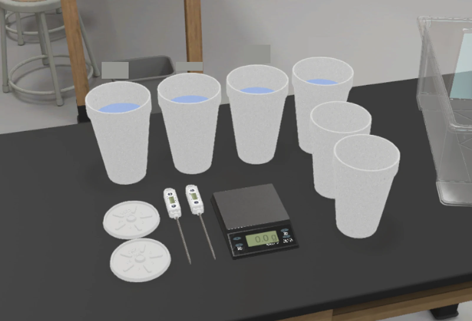
A density lab has five graduated cylinders, four beakers, a pipette and a scale on one bench. In 3D every liquid is a clear fluid in glass, so water, hot water and hydrochloric acid look the same. A student could pour the acid without knowing it wasn’t water.
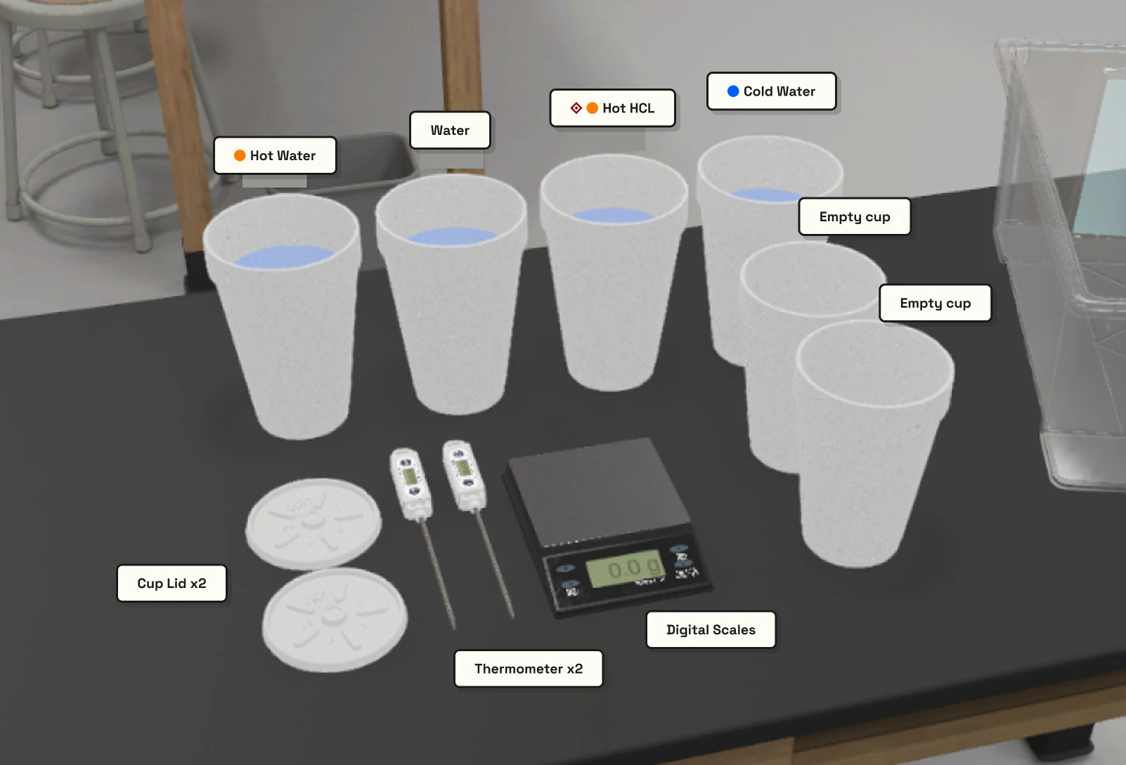
Three models in three months
- Always-on chips on every container, with the current step’s objects in focus and the rest dimmed.
- Two states: a small background label on everything and a full card on the active object. A gradient mask fades labels that are behind other glassware.
- One label, only on what the step uses. The 10 px background layer was hard to read, the wording changed when a step advanced (‘Dye blue’ became ‘Cold water (blue)’), and the model depended on hover, which touch screens don’t have.
The July model labels the object in hand, a vessel receiving a pour from the start of the step, and a drag destination once the object is picked up. Of a cable, only the end in hand is labeled. I gave up the always-on overview, and kept the background layer behind a switch instead of deleting it.
What a label can say
- No numbers
- ‘Warm water’, never ‘48 °C’. A label with the temperature would give away what the student is there to measure. The one exception is the pipette’s volume, where reaching the number is the task.
- Two hazard marks
- A corrosive diamond and a thermal disc. Tinted text and real pictograms were rejected: a pictogram can’t be read at 14 px. The marks never dim.
- Three bands
- Below 10 °C is cold, with a blue disc. Above 40 °C is hot, with an orange disc. Warm, in between, gets the word and no disc.
- Empty vessels
- Whether a vessel is empty depends on the volume it holds, not on its chemistry. A cup waiting for a hot pour reads ‘Cup A (mixing vessel)’.
- Clear of the interface
- A label doesn’t go under the step bar or the time control. It moves to stay 10 px clear.
- Cold waterbelow 10 °C · blue disc
- Warm water10–40 °C · the word, no disc
- Hot waterabove 40 °C · orange disc
- HCl 1Mcorrosive
- Hot HCl 1Mboth · diamond leads the disc
- HCl + NaOHacid + base · one diamond, not two
- Cup A (mixing vessel)empty · no liquid to derive from
Worked out in the kit
The lesson format has a fixed list of object properties, so authors can’t add a hazard or a temperature. The kit works the marks out itself, and I sent a data request for temperature, substance and display names to the team that owns the format. Authors can still show, hide or pin a label for a step, or replace its wording.
Placement took five attempts, from fixed pixels above the object’s pivot to an offset in world space that holds at any zoom. Leader lines were rejected because they looked like callouts.
The drag sequence
When the step opens, the object to move has only its outline and its label. Nothing yet says where it goes. The first click picks it up, and everything about the destination appears at once: a ghost at the landing pose, an arc to it, a ring on the landing spot and the destination’s label. The second click commits. On the ghost, the object settles into place. Anywhere else, it eases back to where it started and the cues go away. Either way the step resolves on the drop, so the student never has to tap the destination.
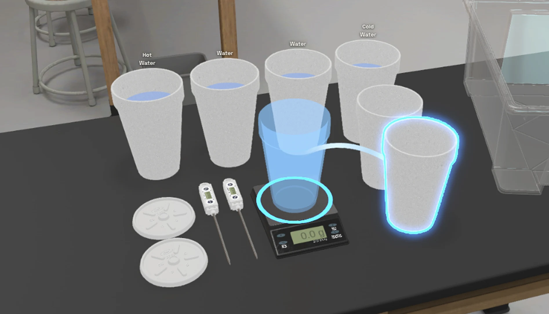
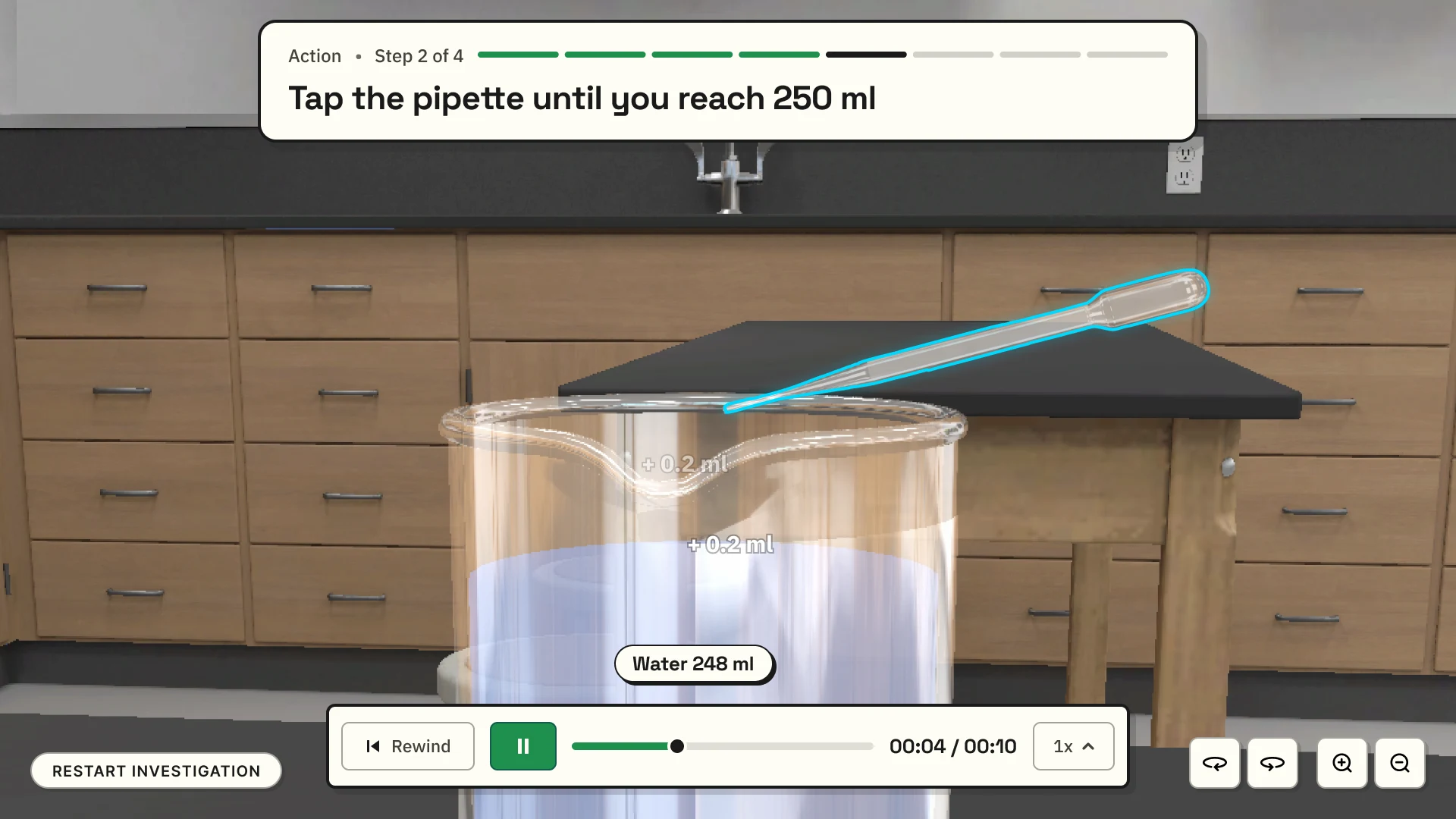
The single-label model, derived hazard marks, per-step overrides for authors and the clearance around the interface ship in the customer release.
Setting a force
Letting students set the force by hand
Investigations often say ‘give the cart a gentle push’ or ‘crank the generator faster’. In the labs built so far, the student clicked the cart and the lesson decided how hard.
I audited the curriculum before designing anything. Force accounted for 22 of the 46 steps, and just over half of the steps asked for a feel instead of a number. So the brief was one control with two readouts: a word when the lab says ‘gently’, and a number only when a real instrument is on the bench. Qualitative examples come first.
Seven designs, three kept
I built seven gesture designs as live prototypes and cut four:
- Flick pad
- A momentum sample. Hard to reproduce, and it has no direction.
- Dial
- Precise, but rotation in these labs is read from a bulb’s brightness or a needle’s swing, not in radians per second.
- Draw and fling
- The value is the release itself, so it can’t be locked and checked before it counts.
- Draw and hold
- A slider with a different look.
A separate wave widget went too. The procedures have no continuous wave: ‘amplitude’ is a ruler pulled back a few centimeters, and ‘frequency’ is a count of releases. Of the three that stayed, the drag-arrow sets a direction, the slider is read against a graduated scale, and the crank sets a rotation by hand.
One sequence for every design
Click to start, move to set, click to lock. It works on a touchpad without holding a button down. A value that only passes through the range doesn’t enable Confirm, and there is no Reset button: to try again, the student makes the gesture again.
What testing changed
- The crank is a heavy spring-mass arm. A flywheel, a free-spinning marker and a cursor follower came first and failed. Reviewers called the spring version twitchy, so it was softened.
- The force scale went from 50 N to 12 N, because the lessons stay between 1 and 10.
- The client found the snap too strong, so its zone went from 10% to 5% of the range. The crank keeps 10%, because a turning hand needs the wider zone.
- ‘Backwards’ became a reading, because ‘crank it backwards’ is an instruction in the curriculum. The step decides whether it is correct.
- After the curriculum specialists’ review, the two-sided arrow for collisions got plain Left and Right labels and the full width. It replaced the dev team’s mount of two separate controls.
Where it stands
The three designs and the two-sided arrow ship in the customer release. The dev team wired them into the step engine and added a keyboard commit. Five investigations use the control, mostly in its qualitative mode.
The limit
In the release the student’s value gates the step: they have to land in range to move on, but the physics runs on the value the author wrote. By the client’s decision the kit owns the control and a documented boundary. Letting the student’s value drive the physics needs changes to the lesson format and the pipeline, which other teams own. Shaking and rubbing, two gestures from the audit, have no design yet.
Waiting
Waiting for the physics without leaving the experiment
Every run is computed on a server and played back, so every run starts with a wait. My first waiting state was a centered ‘please wait’ card over a faint wash, meant to stop stray clicks during the calculation. It also blocked orbit and zoom, which are the useful things to do while waiting. The client flagged it.
Where the signal could go
- A corner badge
- Collided with the microscope panel.
- A chip where Continue appears
- Missed calculations started by a drip or a device control.
- The time-skip callout
- Would have duplicated a surface the lab already has.
- The middle of the time bar
- Chosen: the student is already watching the bar, and it is on screen for every run.
The time bar keeps its frame, its place and the speed dial. Only its middle changes, to a spinner and the word ‘Calculating’. It appears after 2 seconds, so a quick run shows nothing, and once shown it stays at least 1.5 seconds, so it doesn’t flicker. Nothing covers the experiment.
Running
Calculating
Calculating · squeezed
A reversal from live testing
I first kept Previous available during a calculation, as a way out. In live testing, a result that arrived after the student stepped back was applied to whichever step was on screen. Previous is now hidden for the two or three seconds a calculation takes.
What I took back
Taking back my own designs
The floating cockpit
I compared four screen layouts: a bottom dock, a side rail, a folded top and a floating cockpit, with each device control anchored beside its object. I chose the cockpit, and reversed it four days later. The floating controls took too much of the scene, moved unpredictably as the camera turned, and needed too many new rules. A stack replaced it: one device control at a time, at the bottom center, above the time bar.
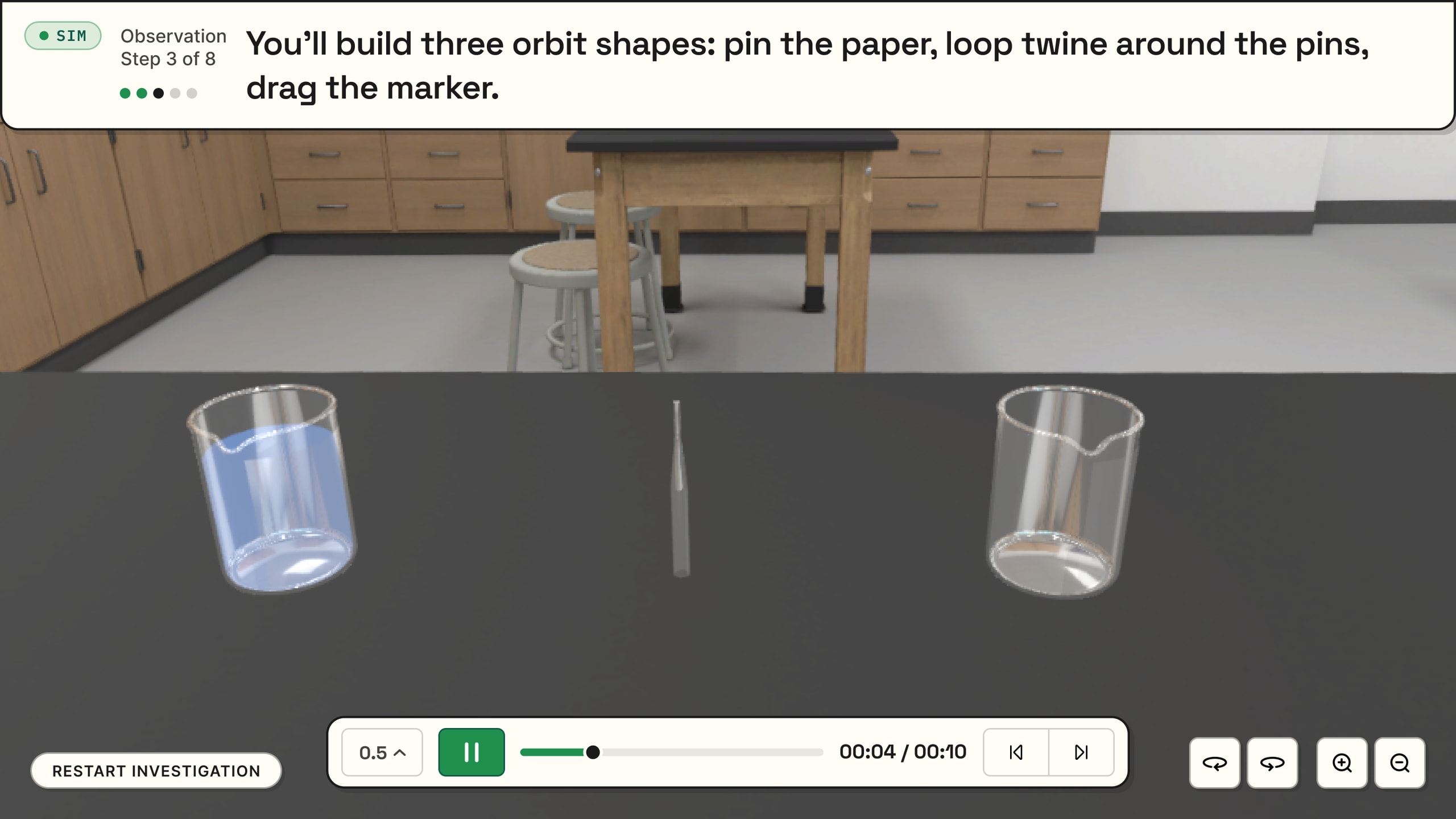
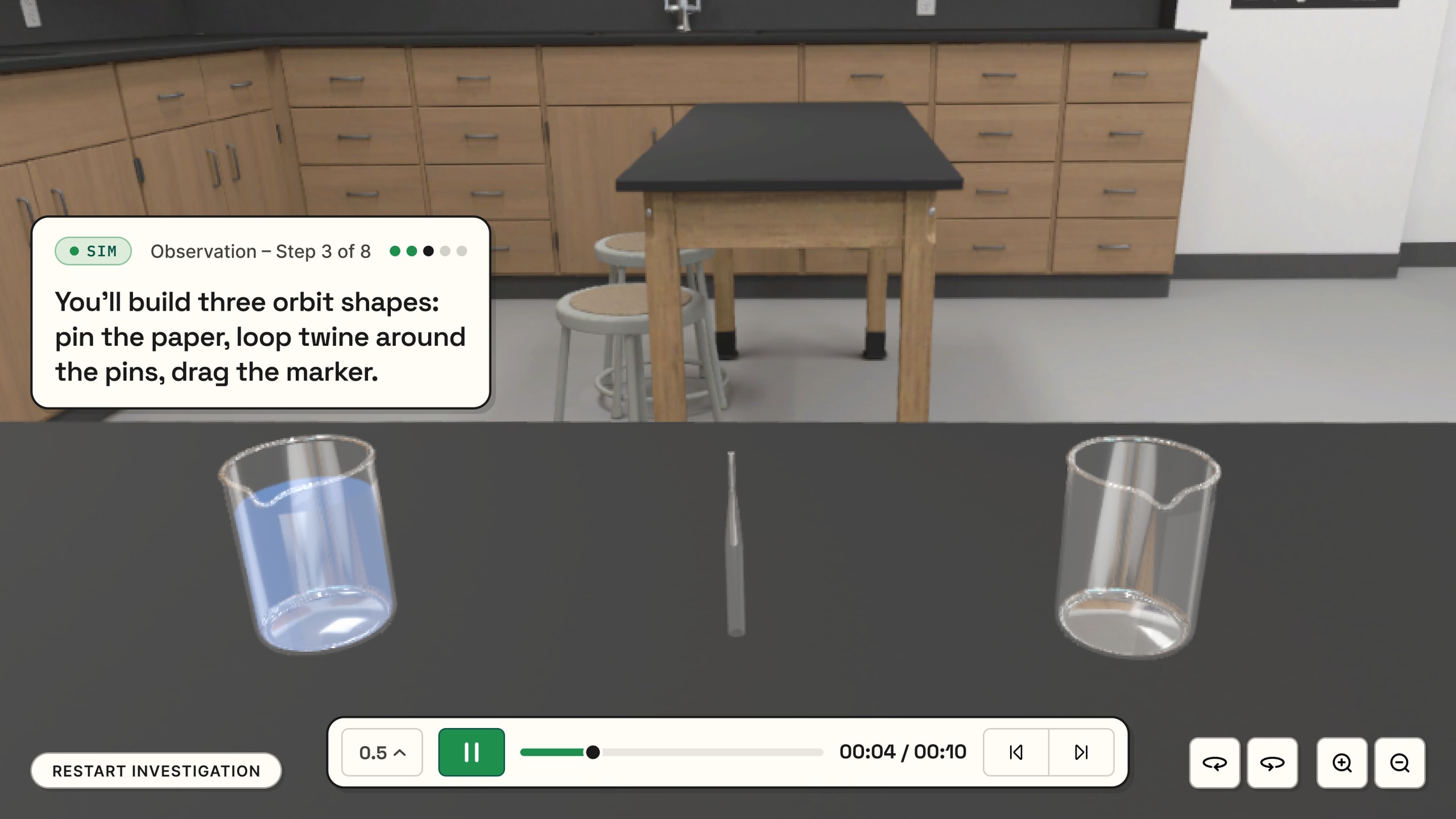
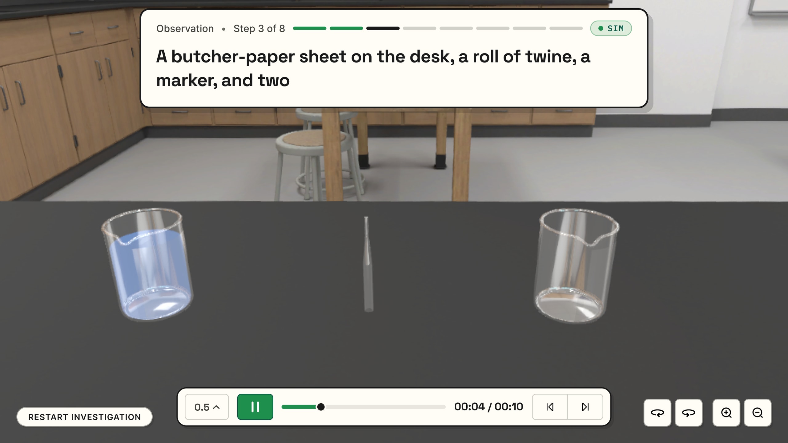
One way to move things
I made click, carry, click the only way to drag, and migrated 87 authored steps from press-and-hold. It uses the same sequence as the gesture controls and the same cues as the labels: the destination appears on the first click, and near the target the ghost turns bright green. The dev team built the carry itself.
Built in code
I built the layer I designed
The kit is the student-facing layer in code: about forty native web components in HTML, CSS and Canvas 2D, drawn over the Unity scene. Unity doesn’t report where an object is on screen or what hides it, so the kit works that out from positions and the camera. The labels and the camera’s safe zone depend on it.
Lab DS, the labs’ visual system, has 159 design tokens. The kit catalog runs on the production code, so a page that looks wrong means the product is wrong. The dev team and the client review against it.
Open the kit catalogEvery page loads the production CSS and custom elements.
Outcomes
What shipped, and what didn’t
In the customer release
- Gesture control: arrow, slider, crank and a two-sided arrow
- About forty device widgets in one family
- Click, carry, click as the single way to place objects
- Single active labels with derived hazard marks
- Per-step label overrides for authors
- Step card and progression
- Time control and the calculating state
- Camera safe zone, gesture framing and the table strafe
- Microscope panel and smell descriptions
- Liquid level marks
- Button hints and the pickup ring
- On/off toggle, merged into one control by the dev team
- Lab DS
Not realized
- The student’s value driving the physics
- Shake and rub gestures
- Background labels and the occlusion mask, parked behind a switch