Product images
for every market, made by the marketer
Grip · Product design · 2019–2022
- Role
- Product design team lead
- Clients
- Coca-Cola, Heineken, Beiersdorf, L’Oréal
- Released
- Spring 2021
- Result
- User activity +45.3%,
30-day retention +29%
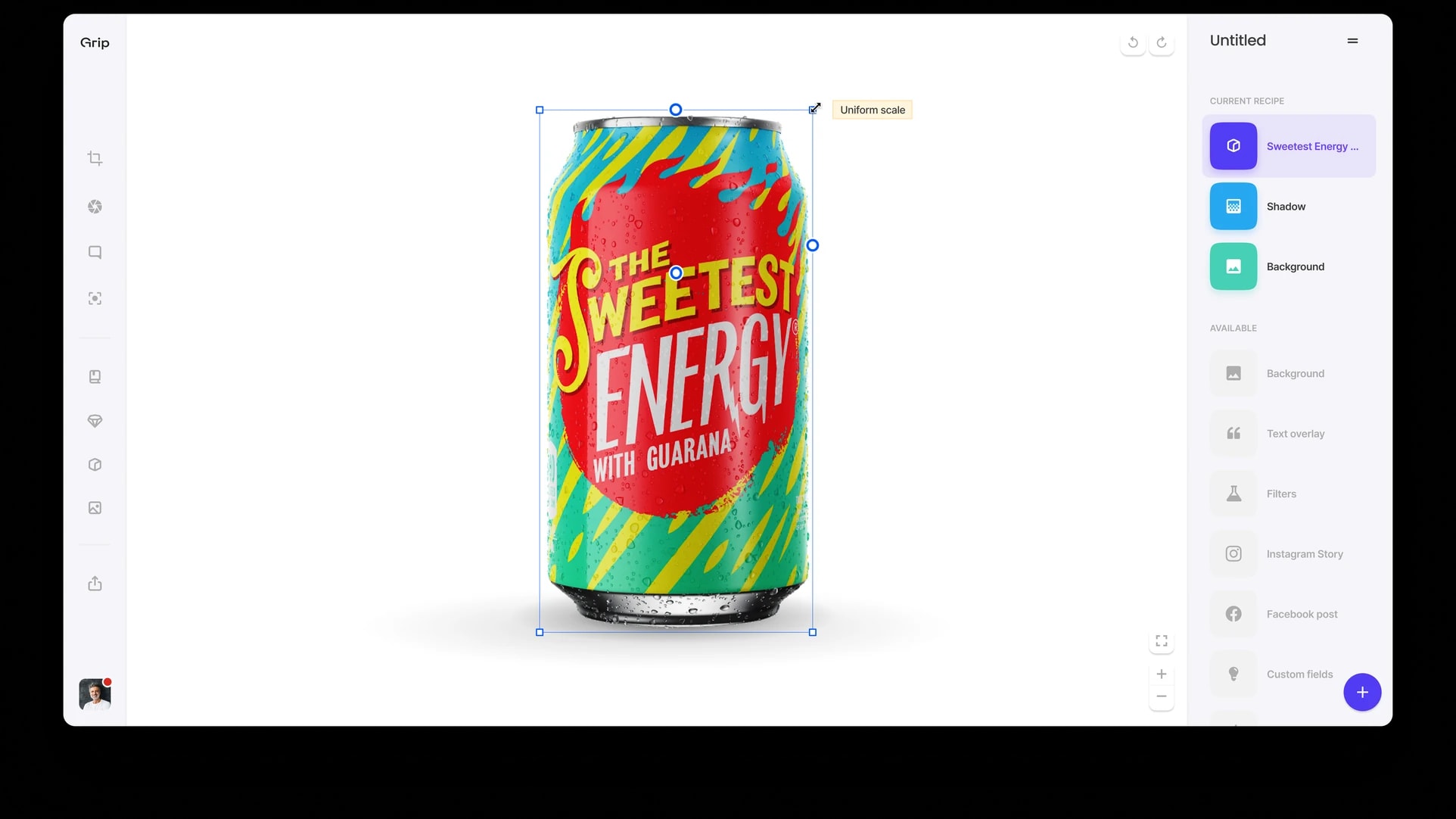
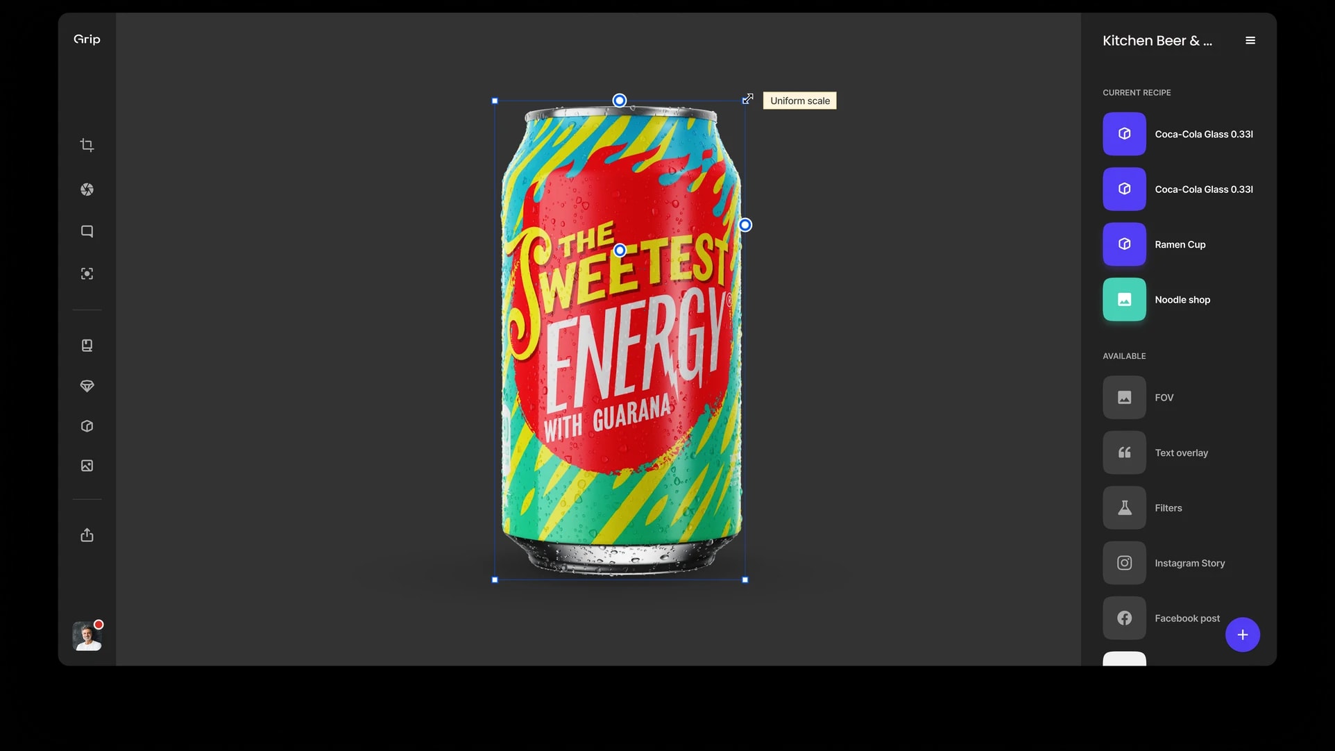
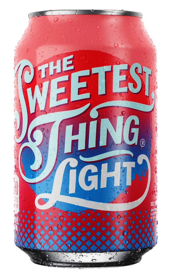
Grip renders on-brand product images from 3D, labelled for every country and language, in minutes rather than the weeks of an agency cycle. Only a small group of top managers and marketers knew how to use its web app, and that limited Grip’s growth. I led the product design team that redesigned it, and did the interface design, graphic design and art direction myself.
The problem
Grip wanted its clients to use the platform more, and to grow into new markets and mid-sized clients. Both needed an app a marketer could learn without training.
Interviews with active users found three problems. The interface was crowded by a growing toolset. Some presets and settings were abstract and confusing. And at least 30% of users worked only through Grip’s API and bypassed the interface.
In walkthroughs with people new to Grip, its strongest features (scale, variation and photorealism) weren’t obvious.
People asked for a tool to upload and adjust their images: replace labels, make quick sketches, and produce images for day-to-day advertising and marketing.
The redesign had to answer these pain points, so that the API users could work in the app too.
Who it’s for
Grip’s users are marketers at multinational consumer brands. They make product images for campaigns that run in many countries, with a local version for each, and for online retailers.
They asked for a tool to upload and adjust images on their own: replace labels, make quick sketches and produce the images their campaigns need day to day. Their work set five requirements.
- 1Create images without the product, or without its label.
- 2Share work with other users and countries.
- 3Use templates, adjust them and save versions.
- 4Create templates, with or without products, from new or approved images.
- 5Export a set of presets for one retailer, such as Amazon.
Users at Coca-Cola, L’Oréal, Heineken and Beiersdorf tested the design. Over several rounds we sent them a prototype build with feedback questions, and revised the design after each round.
The redesign
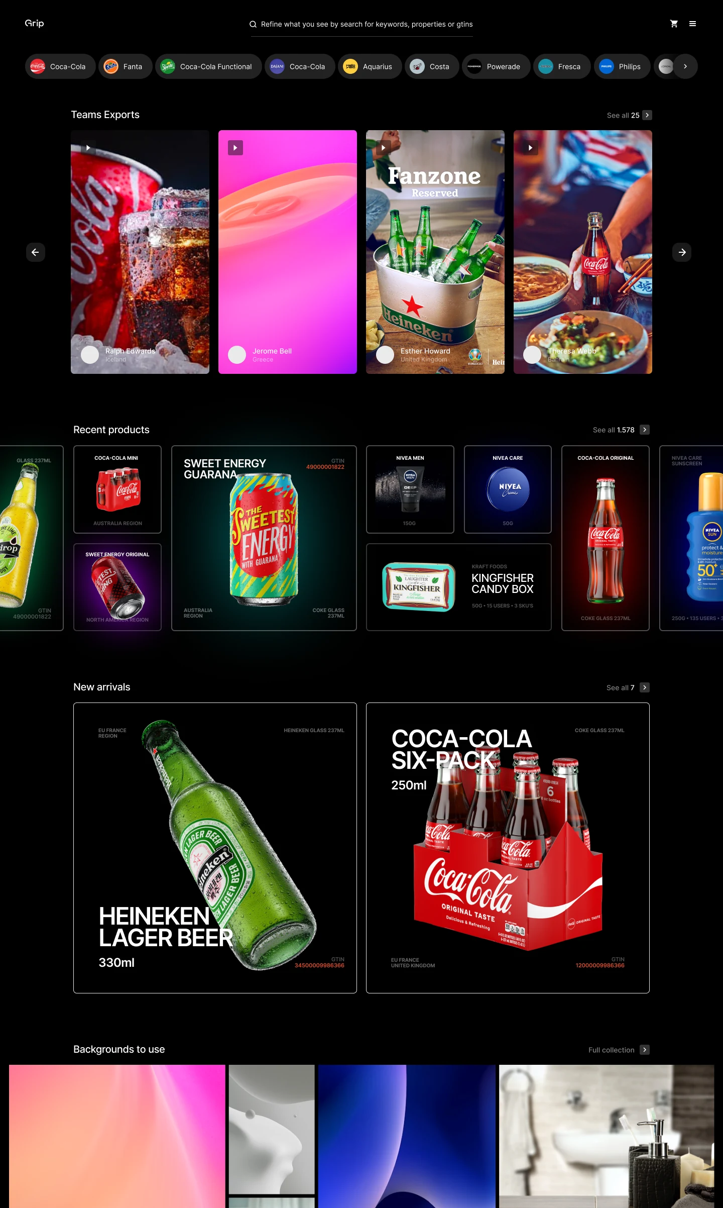
Home shows the brand’s inventory, work from the user’s own and neighbouring teams, new arrivals and the items they worked on last. The inventory is also the brand’s limit. Its users can’t go outside it to invent new colours, textures or labels.
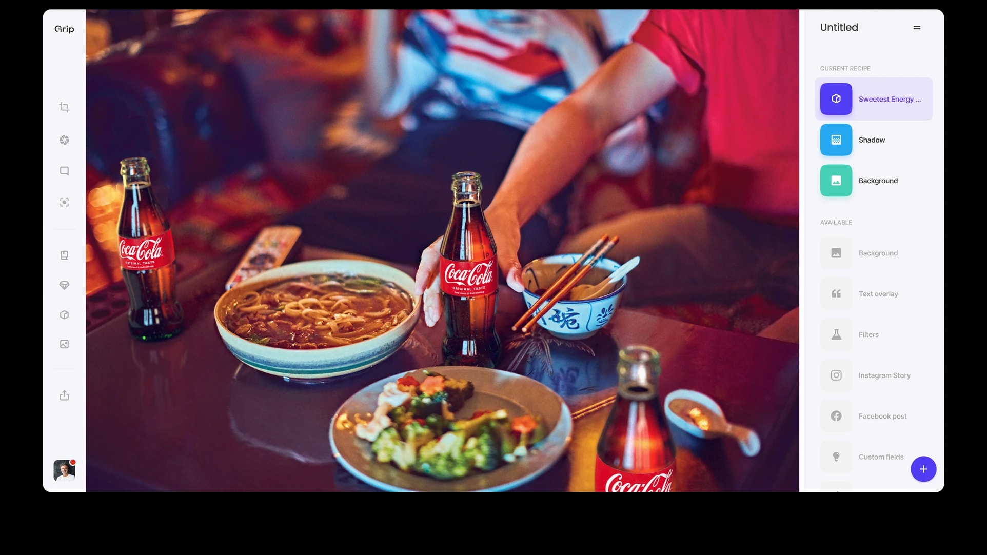
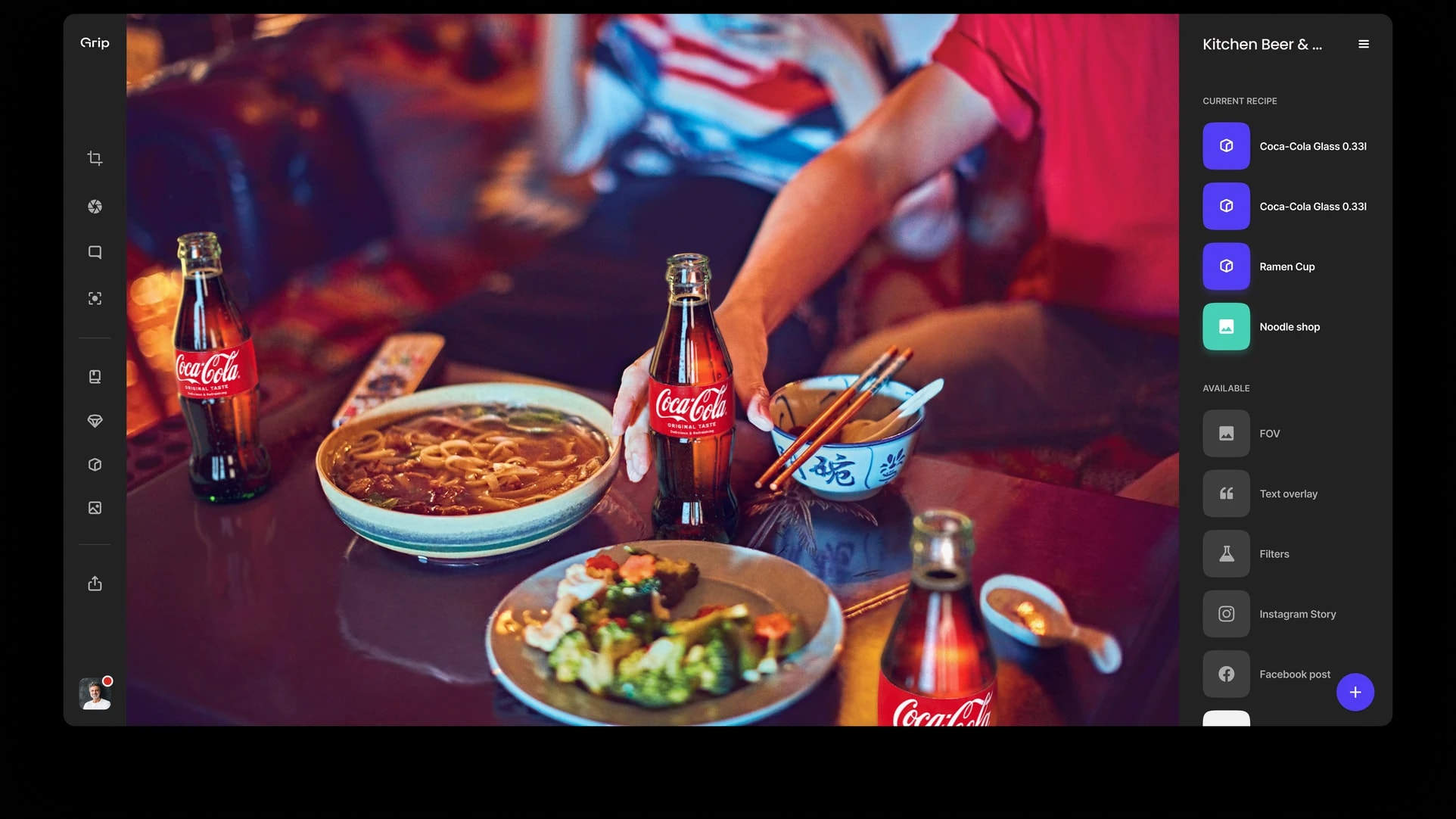
The left panel has the libraries of ready-made items and the working modes. The right panel is a list of layers, one for each background, object, text or logo.
A marketer’s work in Grip is placing labels and changing lights, backgrounds and textures. Layers are a widely understood way to handle that.
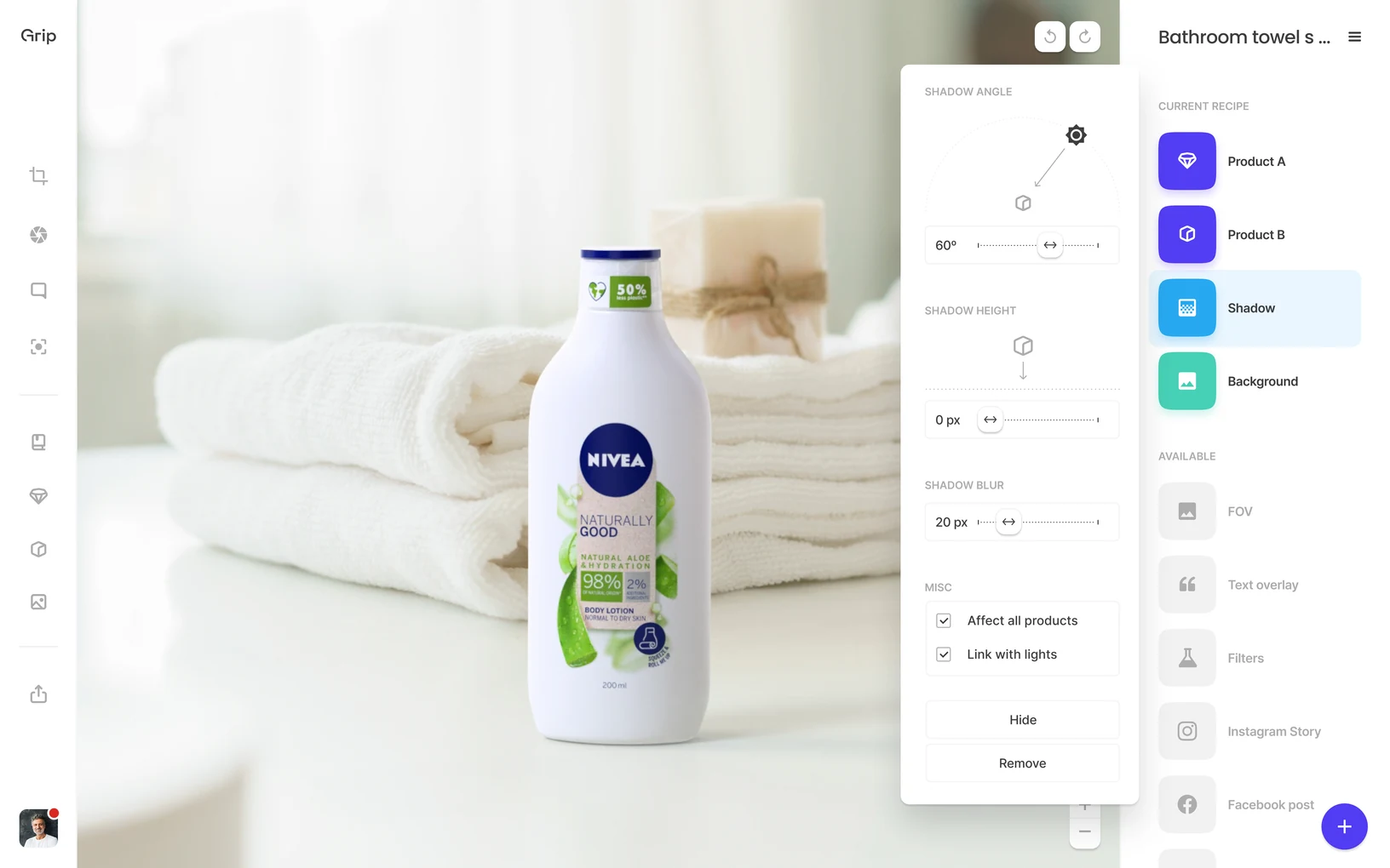
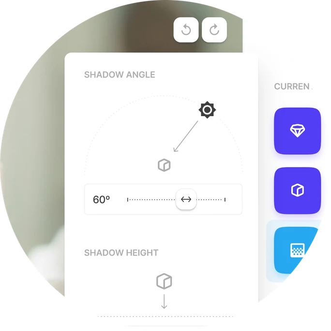
Ready-made objects, from hands and tables to full-body models and podiums, can be moved, tilted and put in perspective, and the image stays photorealistic.
Settings are numeric inputs, sliders and dials. A shadow’s angle, height and blur are linked to the lights.
For power users the app has administration: the organisation’s structure, its roles, and which brand elements and assets each team may use.
The app has a light and a dark theme. Grip showed it in dark, where colourful renders stand out, and the renders were what Grip sold.
The impact
We compared the 90 days after the release with the 90 days before. User activity counts requests, renders and other actions in the app. Retention is the share of users who came back within 30 days. Clients used the platform at different scales, some as a demo, some in a pilot and some in full production.