Yota Devices · UI design & art direction · 2014
A phone
with two screens
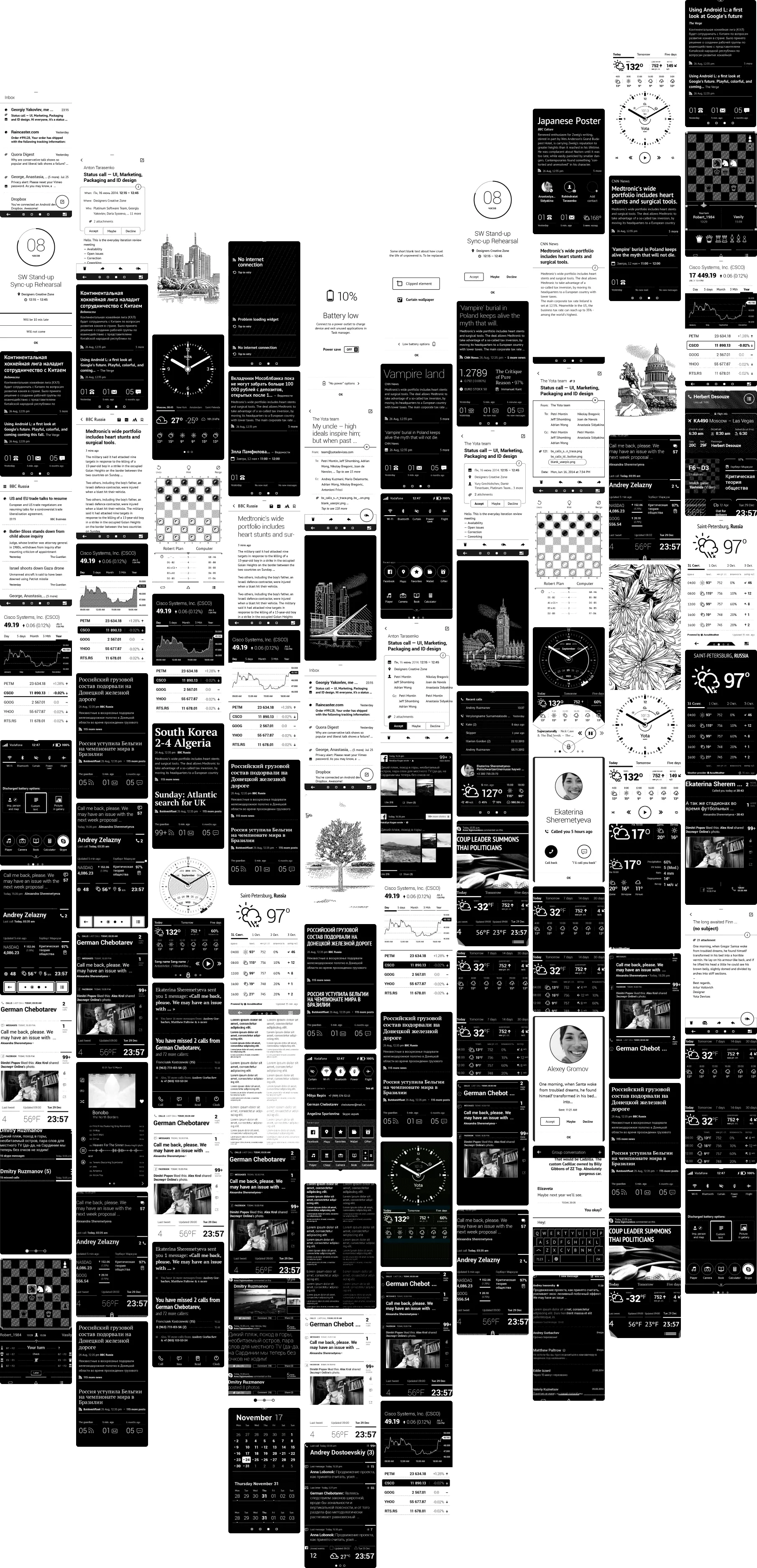
The Yotaphone 2 had a 5-inch AMOLED screen on the front and a 4.7-inch always-on e-ink screen on the back. The back screen had no apps, and nothing to learn from except e-readers. I led its UI design, and we had 180 days to design everything on it.
- Task
- The interface system, widget system, core apps, graphic style, font, iconography and grid for the e-ink screen, and art direction for the teams building apps for the front screen.
- Client
- Yota Devices
- Role
- Lead UI designer and art director
- Year
- 2014
- Team
- Seven designers, and the phone’s development team
- Result
- 35+ apps and 700+ screens in the shipped Yotaphone 2
Everything in 180 days
The scope: UX and UI for 50 core e-ink apps (clock, calendar, calls, messaging and the rest), 10 apps for the front screen, and tested behaviour for every way the two screens meet: flipping the phone, moving an app from front to back, locking and unlocking.
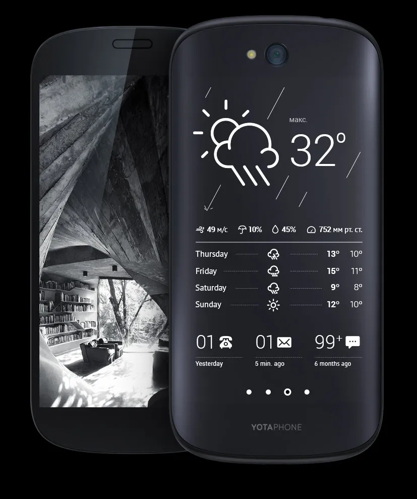
The first decision came before any design. The back screen could be a set of supplementary widgets, or a complete set of apps so you’d rarely need the front screen day to day. We chose the complete set.
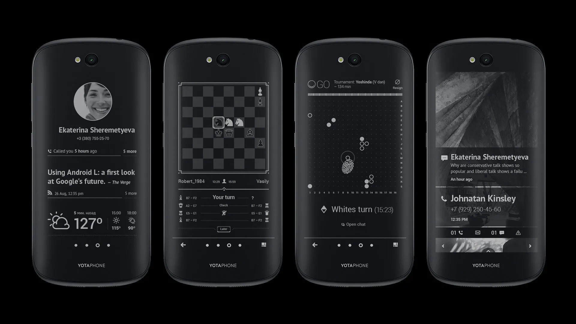
Full phone infrastructure
Besides leading the team, I designed hands-on. I built the groundwork, and the team took it on under my direction.
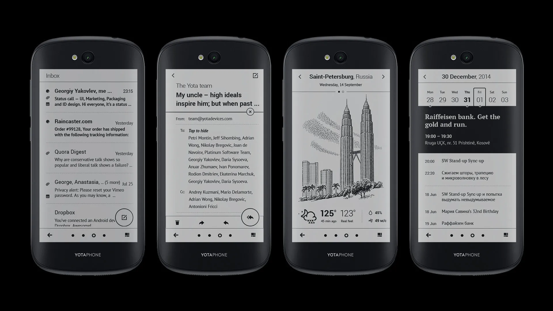
The groundwork was a grid and type that work on a 540×960 e-ink display: low contrast, no light of its own, with and without antialiasing, and a full redraw on every change to clear leftover pixels.
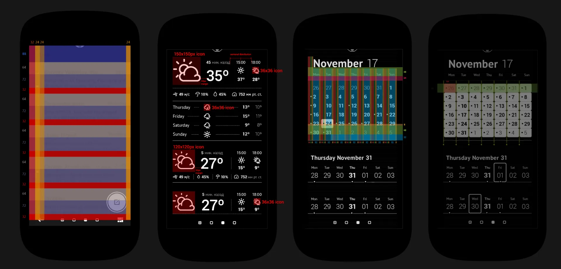
What’s the smallest readable text? Serif or sans serif? How does a button feel responsive on a screen that’s slow to change? We tested and built at the same time, and settled on a mix of iOS and Material patterns that fit the framework’s limits.
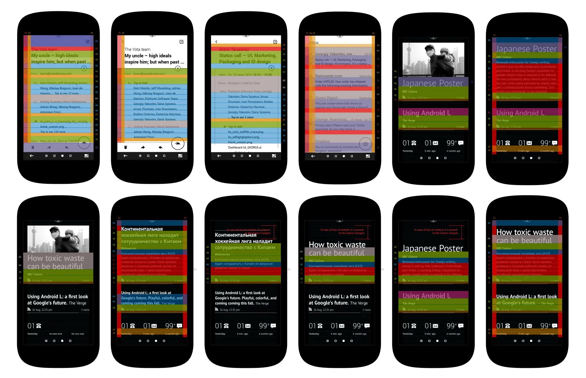
Animation had to go. In greyscale, e-ink shows 32 levels of grey but redraws the whole screen each time. A black-and-white mode can update any region in 50 ms, but it left ghost pixels: a clock hand sweeping 360° smeared the dial. We dropped animation and kept to what e-readers can do.
UX research and development
The hard UX wasn’t in the apps. It was in how they fit the phone: working with the front screen, having no back button, switching between screens, the lock screen, and the limits of e-ink itself.
We ran 17 rounds of tests over the 180 days, testing new iterations and apps every month. More than 2,000 people tested the device.
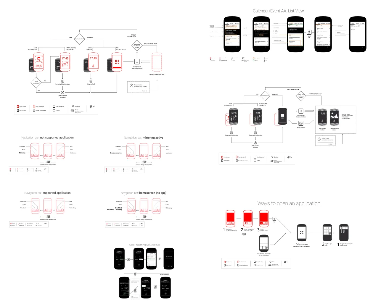
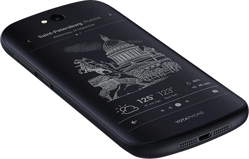
35+ apps, 700+ screens
The plan called for 50 apps. We wrapped up with 35+ apps and 700+ screens, and the Yotaphone 2 shipped with them.